

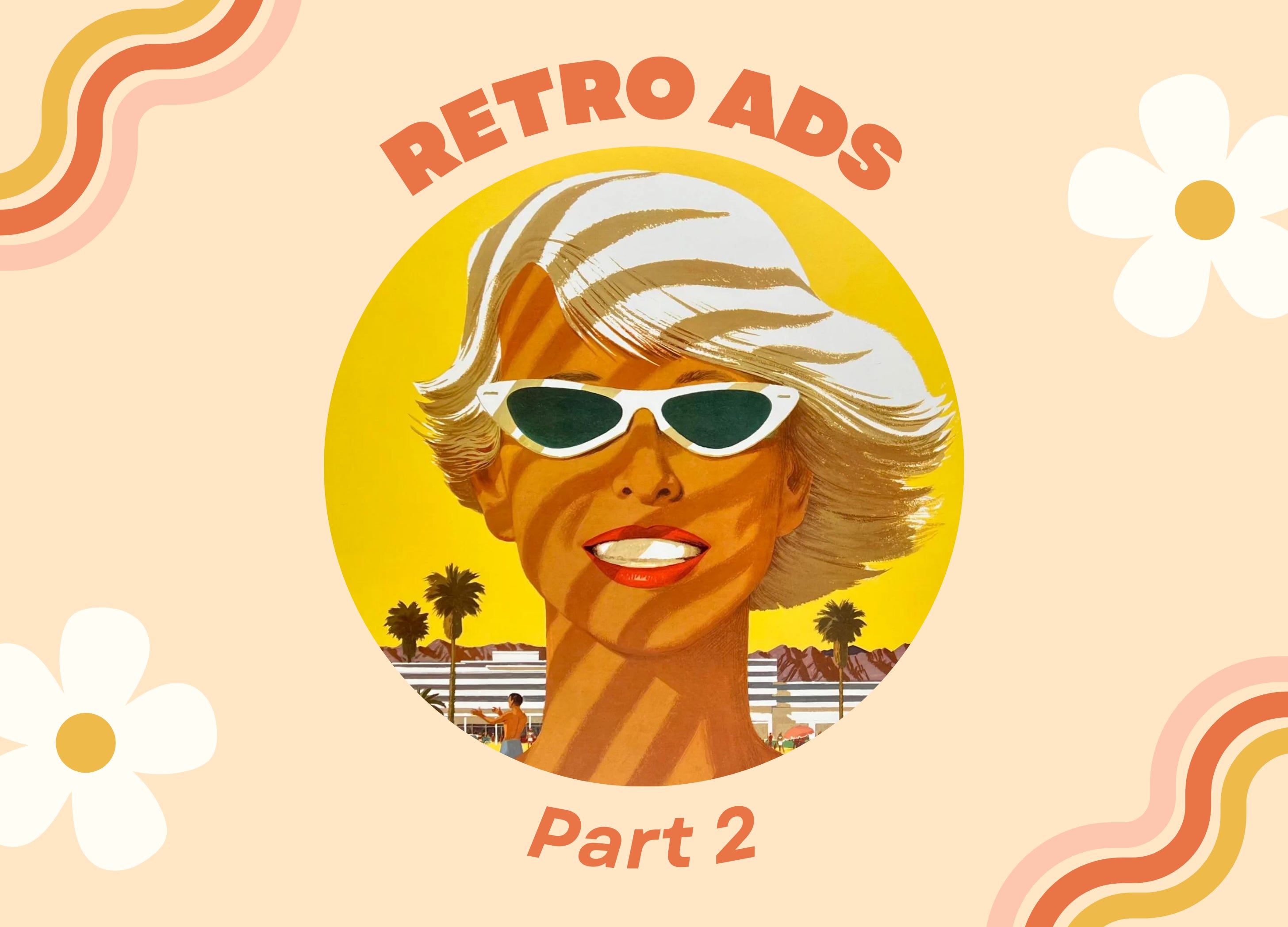
Retro Ads: Part 2
Designs from the second half of the 20th century are iconic for a reason. Let's explore why!


The twentieth century was far from monotonous. Every unique decade was filled with highs and lows. Key events and people altered the course of history. As the world transformed, so did the spheres of art and design.
1910s - America emerged as a world power during World War I. Victory was achieved and spectacular modes of transportation—automobiles, buses, and streetcars—urbanized American society. People abandoned rural homesteads for suburban conveniences and cities expanded. Many individuals stopped producing homemade goods. Instead, they bought ready-made clothes, food, and household items from local stores or catalog retailers. Time was of the essence!
1920s - The Roaring Twenties were renowned for silent film stars, glitzy parties, bootleg alcohol, jazz, and flappers. Women earned the right to vote and modern inventions—especially Ford’s Model T—revolutionized American culture. An “affluent” consumer culture rose to the forefront. Movies and avant-garde fashions were all the rage! People acquired unprecedented freedoms, but conservative segments of society recoiled in response to what they considered “excess.”
1930s - The Great Depression scarred the American landscape, but art and culture flourished. Swing dancing, radio shows, fireside chats, and talkies (films with sound) provided a much-needed escape.
1940s - During the Second World War, many women—no doubt motivated by Rosie the Riveter’s catchphrase—met rising manufacturing demands. Food and supplies were rationed, but American citizens persevered, fulfilling every patriotic duty. The end of the conflict ushered in a period of peace and prosperity. Families moved to the suburbs, birth rates increased, and post-war consumerism hit record-breaking highs.
1950s - A vast majority of American families benefited from disposable income. They purchased color televisions, cars, and automatic appliances like microwaves or refrigerators. Industries like cinema, music, science, technology, and fashion entered their Golden Ages. However, beyond the white-picket fences, manicured lawns, and pearly-white smiles lurked a dark undercurrent of suspicion that reached its peak with McCarthyism and the Red Scare.
After the 1950s, there were even more changes in store! Wars, political intrigue, progressive movements, scientific research, and impressive inventions of the 1960s, 1970s, 1980s, and 1990s ultimately shaped American art and design for years to come. We are still experiencing the effects of the previous century today.
Did you miss Part 1 of this discussion? Check it out here!
1960s
Key Elements: Pop art + Bold graphics + Vivid colors + Geometric shapes + Psychedelic patterns + Curvilinear shapes + Optical illusions + Minimalism + Hand-drawn typography
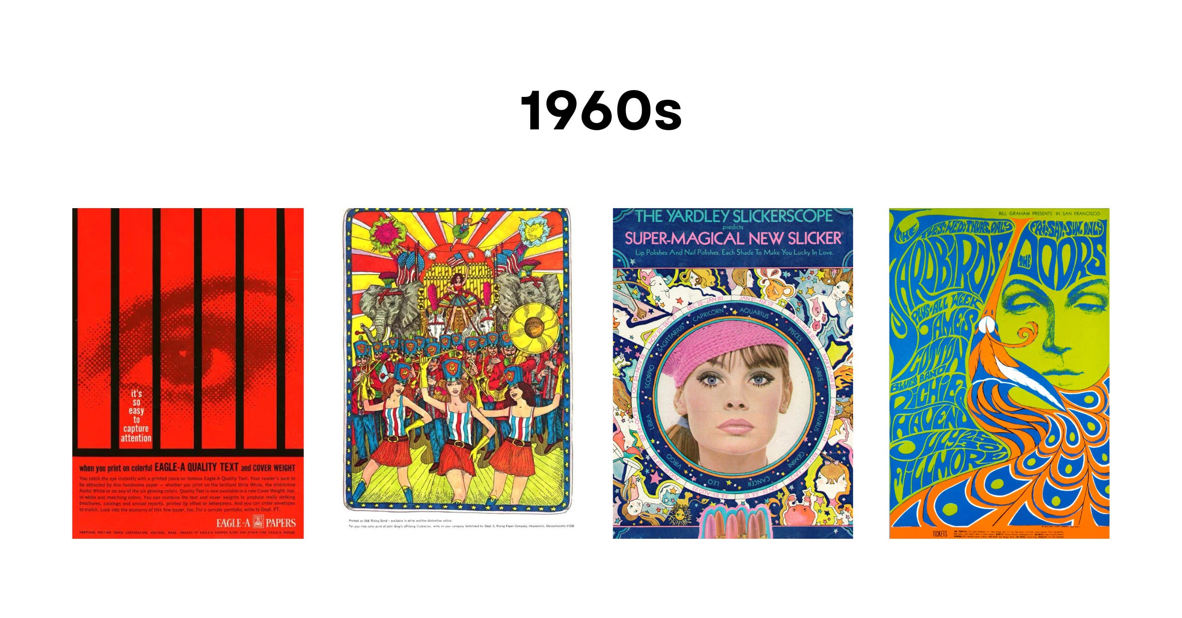
The ‘60s signaled the beginning of counterculture movements. In 1961, minors comprised nearly 50% of the American population. Teenagers’ alternative interests contributed to the growing cultural divide. Freedom, peace, love, and harmony were the youth’s dominant values.
Aside from music performances or variety shows, color televisions displayed anti-war protests, feminist marches, and civil rights demonstrations. Mainstream media also chronicled the contentious “space race” between the United States and Russia. Ultimately, victorious American astronauts landed on the moon in 1969. Discoveries across the fields of science and technology led to state-of-the-art materials and manufacturing techniques. These opened the door for more daring design choices!
1950s culture prized modern layouts, sophisticated silhouettes, and sleek fonts. Towards the end of the decade, people tested pastel shades like turquoise. This paved the way for vivid colors during the 1960s.
Art and design scenes were revolutionized by out-of-the-box creatives like Andy Warhol and Roy Lichtenstein. Motifs soon emerged across American homes and offices. Decorative surfaces were covered in polka dots, psychedelic patterns, curvilinear shapes, optical illusions, or hand-drawn typography. Some of these shifts were guided by Americans’ experiments with LSD and other mind-altering drugs. And where were these commonly used? Music concerts and festivals like Woodstock, of course!
The widespread success of minimalism proved how disoriented Americans were with the establishment. Many rejected materialism, instead valuing simplicity and negative space.
1970s
Key Elements: Persona-driven graphics + Vivid colors + Simplistic flat shapes + Abstract patterns + Hippie iconography + Freeform typography
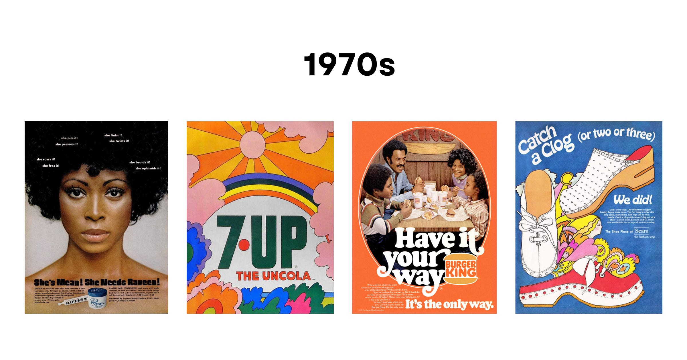
American activists continued seeking social change well into the 1970s. Across the globe, international conflicts—especially the Vietnam War and the Cold War—raged on. Political scandals shocked the public, inflation reached dangerous levels, and governmental mistrust increased. Individuals challenged traditional values and ventured onto paths of self-discovery, experimenting “with exercise, psychotherapy, health food, and alternative religions.”1 A desire for personal expression shaped fashion, music, interior design, and other cultural trends. Lava lamps, tie-dye fabrics, bell-bottom jeans, platforms, feathered hair, afros, shag carpets, groovy patterns, disco tracks, rock bands, and socially-conscious music became exceedingly popular.
Graphic art showcased famous personas and characters intertwined with real photography, mind-bending illustrations, chaotic collages, and statement fonts. Concert posters were the most striking manifestations.
While key 1960s art and design styles—bold graphics, vivid colors, shapes, and patterns—continued throughout the 1970s, several elements were reinvented!
Grounded earth tones like “avocado greens, rustic browns, and mustard yellows” superseded light and bright pastels from the mod era.2 Simple, flat shapes were layered to create “groovy” patterns. While some repeated perfectly, others leaned into abstraction. Forms were inflated, contorted, and twisted until they were nearly unrecognizable.
In a time of war and division, American citizens wanted peace, love, and flower power. This translated to nature-centric, hippie iconography: peace signs, hearts, mushrooms, butterflies, and flowers with smiling faces.
Due to technological breakthroughs, designers had more control over lettering. Fonts could be funky, irregular, slanted, swashed, swirled, or bubbled. If they could dream it, they could create it!
1980s
Key Elements: Futuristic visions + Geometric typefaces + 3D effects + Neon colors + Tropical aesthetic + Floral prints + Playful patterns and textures
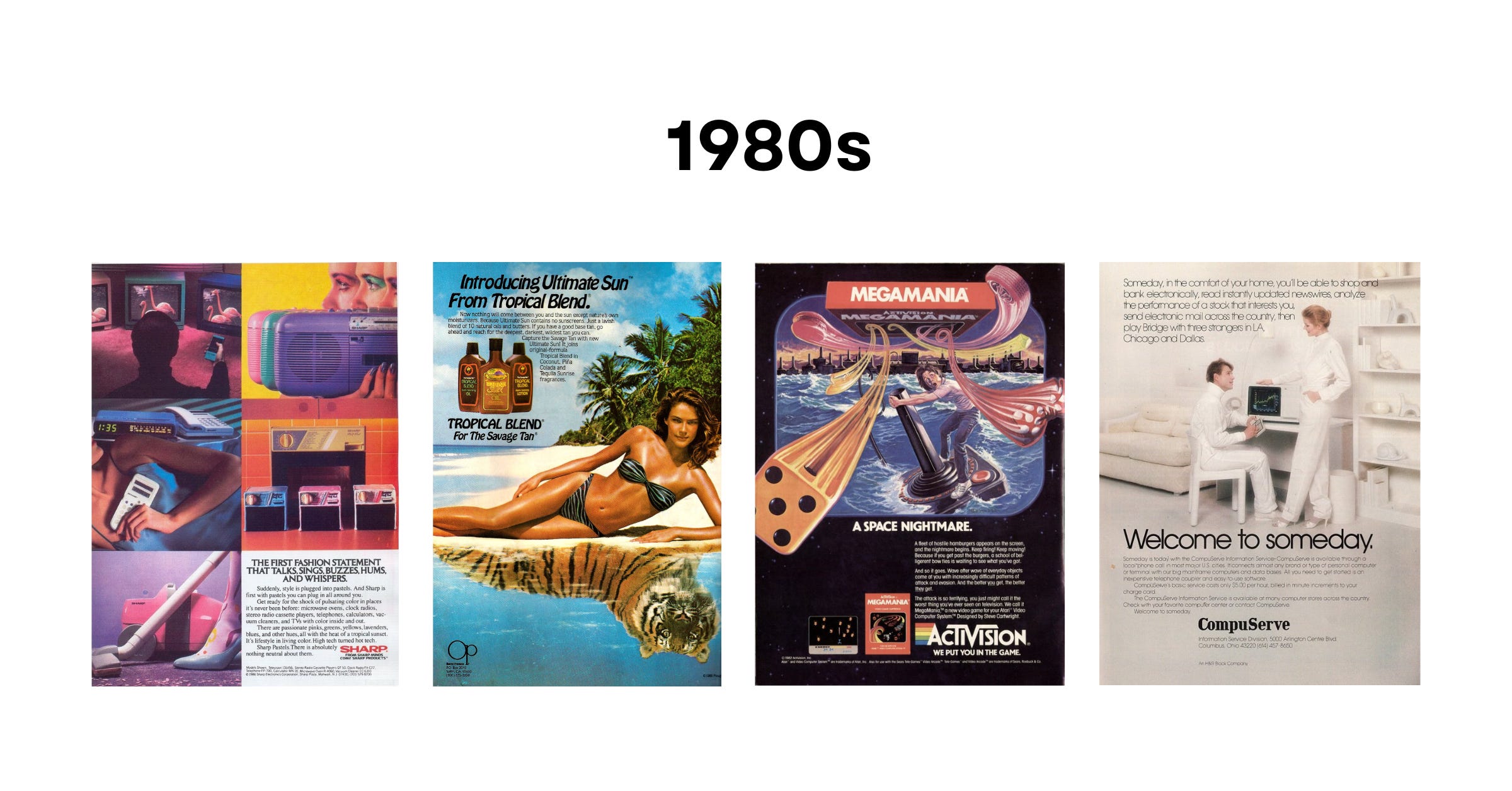
In response to the previous decade’s counter-culture, “a new conservatism arose in social, economic, and political life”3 during the 1980s. Blockbuster movies and family sitcoms offered an escape. Cable networks sparked the attention of Americans. For example, MTV aired music videos that launched the careers of countless artists. It made a lasting impression on the youth’s tastes in fashion, hairstyles, makeup, and music. Punk, new-wave, rock ‘n roll, and preppy were common expressions. Meanwhile, urban professionals with traditional sensibilities—another social group known as “yuppies”—were known for earning college degrees and high-paying jobs.
Wealth was on the rise and hyper-consumerism returned to America. Cutting-edge science and technology equipped and inspired.
As computers evolved, so did geometric typefaces. Thick borders, bold fonts, gradients, shadows, and sharp angles became prominent. Pixels, grid systems, glitches, and VHS effects were integrated into designs! These features reminded people that even technology had its limits.
After communism’s demise, optimistic Americans envisioned a better future for all. It was a new era filled with neon palettes and tropical vibes! There were electric blues, hot pinks, highlighter yellows, siren reds, and alien greens everywhere. Palm trees, flamingos, sports cars, sunsets, and Miami beaches were leading symbols. This aesthetic developed into Neon Noir, a genre promoted by TV shows and films including Miami Vice and Risky Business.
Large-scale floral prints were callbacks to the 1970s, but the 1980s imbued playful patterns and textures with dynamic energy. This is when the eclectic Memphis Design style was invented. Originating in Italy and influenced by Art Deco, it was distinguished by modern shapes, symmetry, layers, and contrasting colors.
Fueled by profitable market trends, advertisers took big risks and many paid off! Campaigns featured highly stylized photography with supermodels or celebrities, catchy slogans, and bold text.
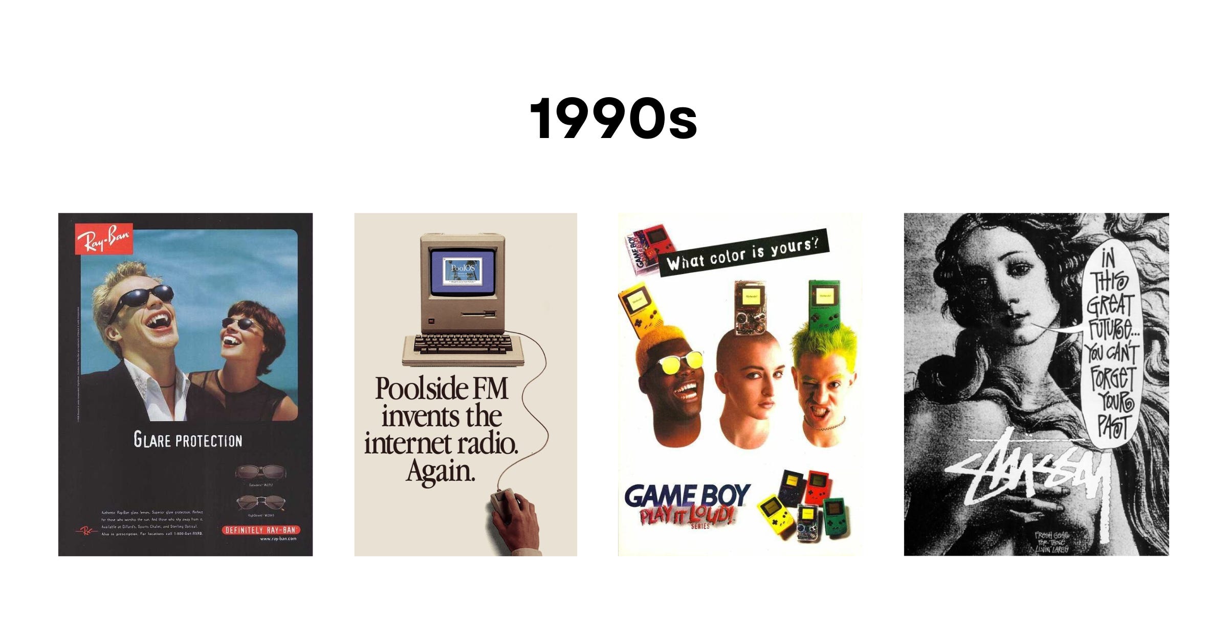
1990s
Key Elements: Techno-futurism + Mixed media and collage + Grunge aesthetic + Scale and spacing experiments + Innovative type + Minimalism + Monochromatic color schemes
The dissolution of the Soviet Union in 1991 reconfigured the world map. Peace and prosperity reigned in the United States. Americans embraced technology and entertainment. There was no shortage of content for watching or listening. VHS tapes, video game consoles, cellphones, portable music players, and computers became household items. Fueled by the Internet’s advancement, Google and Amazon also gained traction. Inventions like email elevated productivity levels and connected more people than ever before.
Memphis Design, clashing neon colors, geometric shapes, and abstract lines persisted until the early 1990s. Yet, the last decade of the twentieth century was defined by technological progress. Americans were future-obsessed—hello Y2K! Artists experimented with graphics that belonged in science-fiction novels, virtually replicating metallic finishes, distortion, and dimensionality.
Analog and digital media collided across designs. Scanners captured shredded paper or inky splotches. Such imperfect textures were collaged with fonts, images, and other visually interesting materials.
The grunge aesthetic was perhaps the most pervasive. Opposing mainstream culture, it was rebellious, edgy, and non-conformist. Teens all around America wore flannel shirts, ripped jeans, and “cool” second-hand finds. Designers pushed boundaries with unorthodox layouts, hand-drawn elements, crooked objects, photo cutouts, distressed fonts, and gritty backgrounds.
There were many text effects to choose from. Comic Sans was one of the most celebrated fonts. Star Wars opening credits inspired floating 3D text. Deconstructed typography encapsulated the anti-design movement.
Later on, minimalism replaced much of the ‘80s superfluity. Designers valued clean lines, balance, and harmony. Function was the ultimate goal. That’s why they utilized monochromatic color schemes, clear text, concise imagery, and negative space more often.
What event dramatically altered the graphic design industry? The arrival of Adobe’s Photoshop 1.0 in 1990. This software made it possible to achieve “overlapping text, faded elements, and digital overlays.”4
In 2024, we may have social media, cell phones, laptops, WiFi, and artificial intelligence. But have you noticed that many art and design trends are recycled today? 3D type, bubble text, clashing colors, ‘70s nostalgia, vintage minimalism, anti-design, abstract gradients, realistic textures, geometric shapes, intricate illustrations, charming logo mascots, and more are here to stay!5
The past is ever-present.
What impact will our generation have on later decades? Share your predictions below!