Retro Ads: Part 1
These ads are far from boring! Let's study memorable designs from the first half of the 20th century.
We are currently living in the digital age. While advertisers spend less on newspaper and magazine spreads, they are far more motivated to craft interactive campaigns across social media posts, blogs, and emails. And that’s just online. High-budget commercials featuring A-list talent continue to dominate network television and streaming services.
Before radios, televisions, and computers rose in popularity, people relied on printed materials for information. Newspapers, pamphlets, posters, and magazines flourished for decades. As average citizens flipped through pages, searching for current events or opinion pieces, they were inadvertently exposed to the latest and greatest products and services.
What can we learn from retro ads in the modern era?
They inspire us to slow down and appreciate traditional craftsmanship. Phones and tablets are convenient, but nothing compares to holding hard copies. Machines printed, but real artists had to sketch, draw, and paint by hand. No wonder many of their works are now collectibles!
Vintage advertising also reveals wider trends across various industries: art, design, food, fashion, beauty, travel, finance, and politics. It showcases how men and women from previous generations thought, communicated, and lived.
Furthermore, investigating different cultures increases empathy. Even if we don’t always agree with our predecessors’ decisions or values, they are put into perspective. Context is essential.
The past teaches us about the present. And old-fashioned ads preserve history! For example, promotional photographs captured everything from local customs to international news. Revisiting these primary sources reminds us how far we’ve come.
Over the next two newsletters, we’ll explore the magic of retro ads! Part 1 is dedicated to the 1910s, 1920s, 1930s, 1940s, and 1950s.
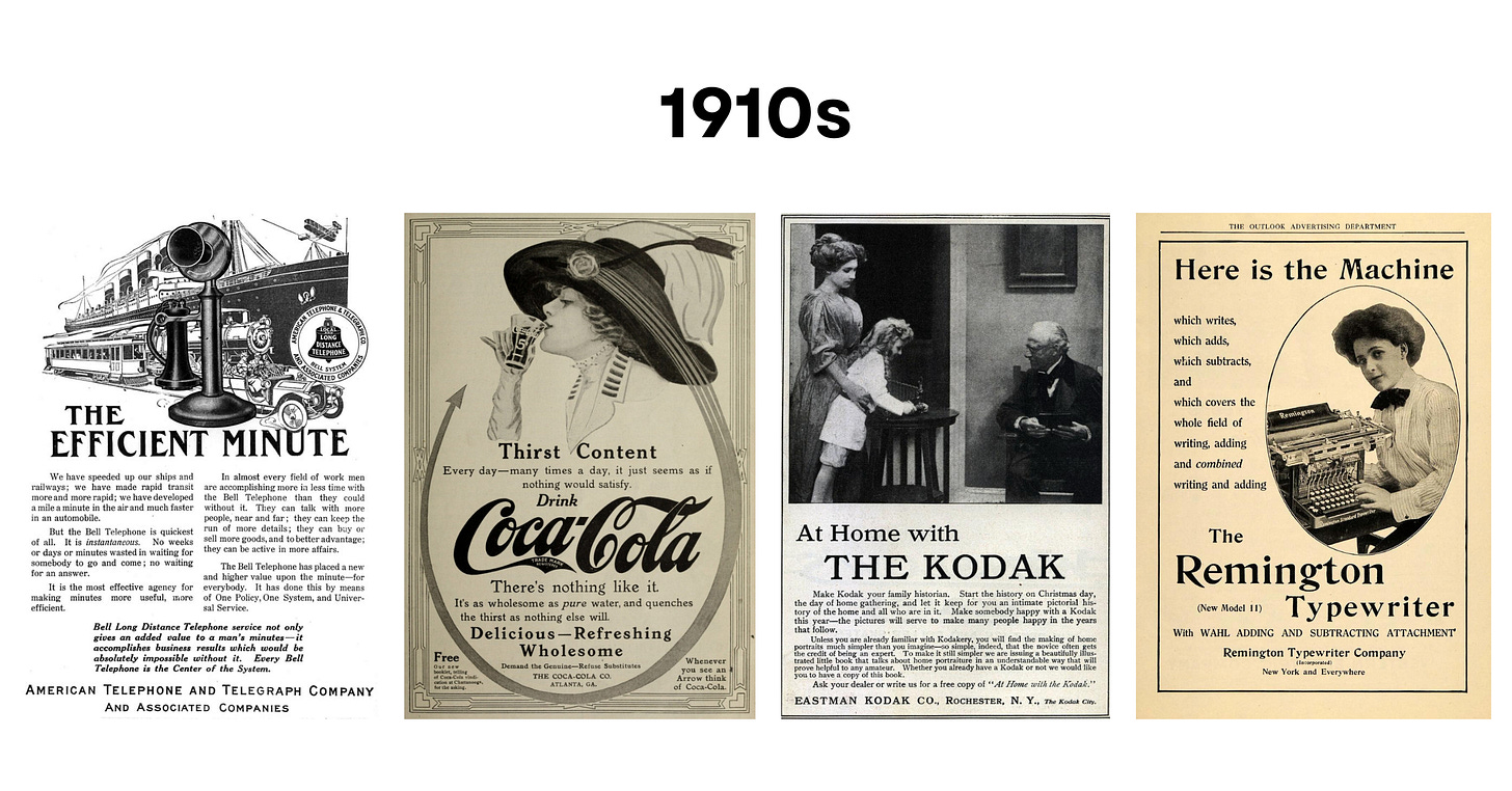
1910s
Key Elements: Clear structure + Bold and large text + Intricate logos + Storied illustrations
Many of the original 1910s advertisements were featured in newspapers! This explains why the above prints prioritize large-format designs with several lines of text. Bold headings and elements emphasized the most important information.
Color printing—a far more complex and expensive process—was rare during this period. Yet, the ads were not stagnant. They told stories with clear structures and lovable characters! Also, intricate logos were usually accompanied by detailed illustrations.
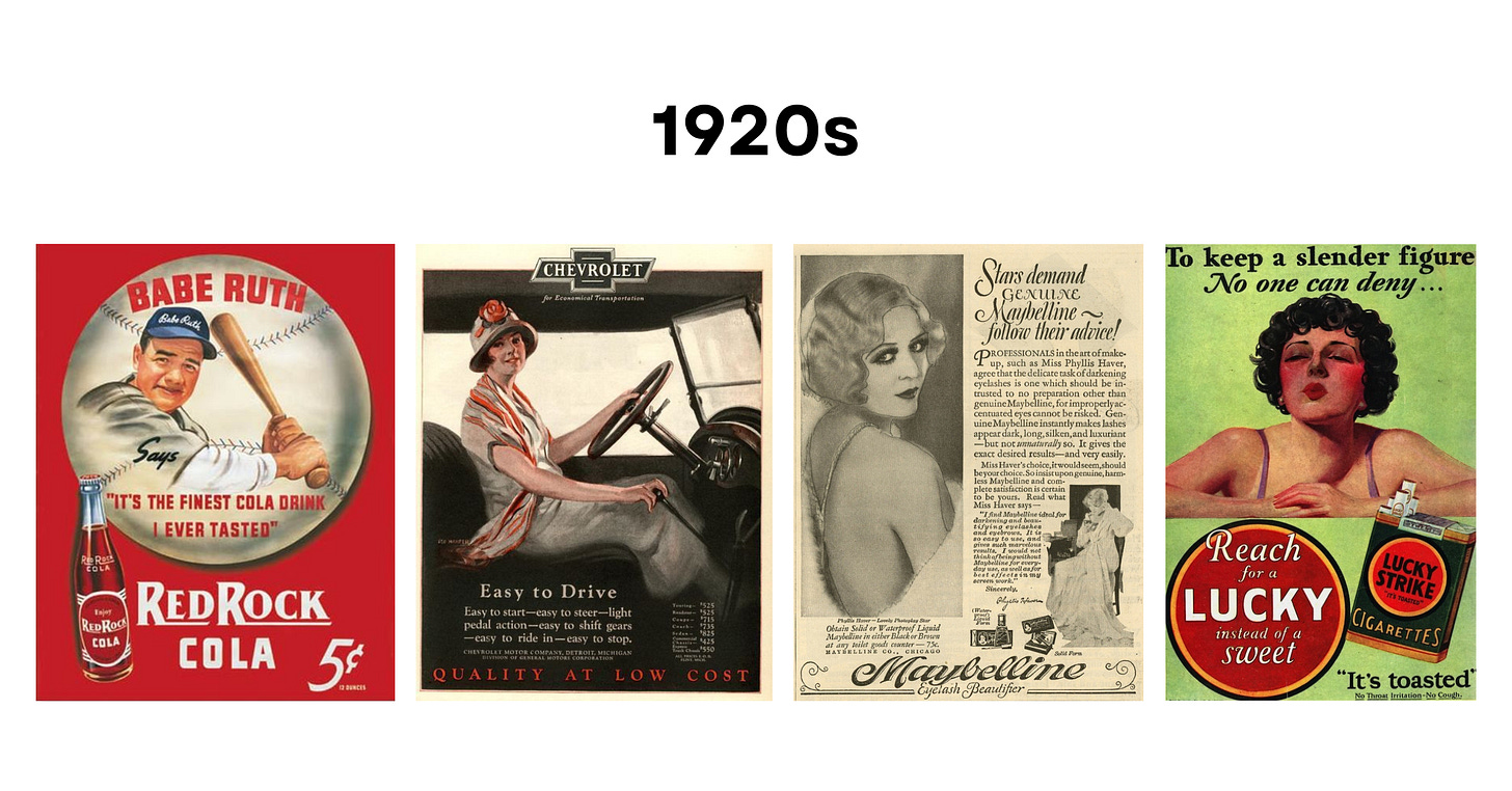
1920s
Key Elements: Italicized text + Ornate fonts + Elegant illustrations + Silhouetted photographs + Celebrity endorsements + High-contrast palettes + Symmetrical compositions
The Jazz Age marked a dramatic shift in American culture. Women gained the right to vote and embraced daring fashion fads—hello flappers! More Americans lived in cities than ever before. And the nation’s total wealth had doubled by the decade’s end.
People partied in the middle of the Prohibition. In other words, alcohol was banned, but that didn’t stop them from imbibing in secret. Plus, soda sales grew exponentially!
Fun Fact: Ford’s Model T was the most revolutionary consumer product invented in the 1920s! Cars provided Americans with “freedom to go where they pleased and do what they wanted.”1
The cult of celebrity emerged during The Roaring Twenties. Actors like Charlie Chaplin and Gloria Swanson gained unprecedented fame. They were featured in far more advertisements, especially for cigarette brands. Fashion, makeup, and cleaning products were other familiar subjects.
Symmetrical layouts with leading lines created a sense of harmony, but luxe jewel tones with pops of red were all the rage. Although colors were consistently popular across products and advertisements, palettes exploded in the 1920s.2
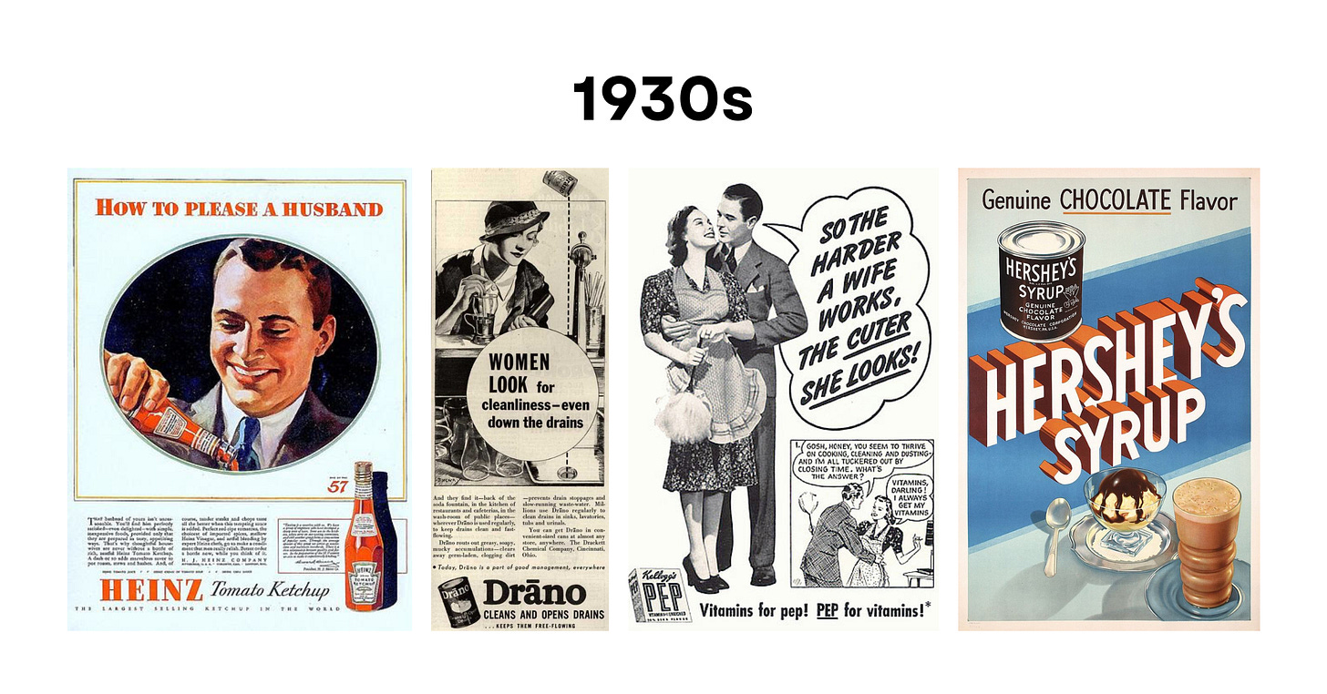
1930s
Key Elements: Bold text + Themes of thrift + Realistic illustrations + Central female characters + Muted colors
The ‘30s brought The Great Depression and World War II. It was a time of trials and tribulations. While men searched for job opportunities, most women were encouraged to stay at home. For five years straight, the U.S. government only permitted one member from each household to work. Many magazine and newspaper ads featured ladies cleaning, cooking, and hosting. Even if the working woman wasn’t widely celebrated in American culture during the 1930s, many wives rejected stereotypes and pretended to be single to advance their careers.
Companies decreased their advertising budgets, but some products—especially radios—thrived. The style of printed advertisements can be described as practical, clear, concise, and female-focused. As the center of the family, they held a lot of buying power.
Fun Facts:
The recipe for chocolate chip cookies was an accidental discovery during this time. What a sweet surprise!
Kodachrome introduced color film photography to the masses.
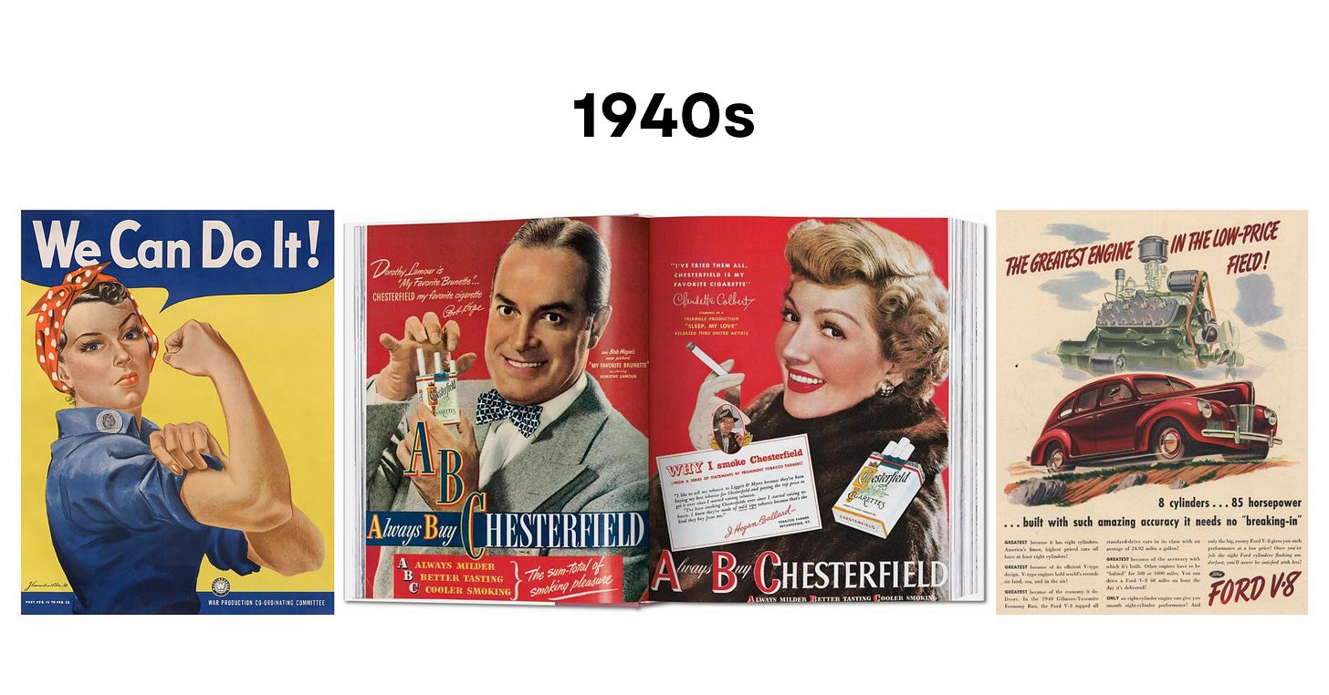
1940s
Key Elements: Themes of unity and patriotism + Positive mood + Idyllic illustrations + Polished photography + Celebrity endorsements + Pops of color
Although The Great Depression ended in 1939, Americans were ushered into war in December 1941. While their fathers, brothers, and husbands fought overseas, women returned to the workforce. The poster of Rosie the Riveter, an illustrated female factory worker with a flexed bicep, inspired many to enter military service. Every citizen made sacrifices for the greater good.
In addition to gasoline, the government rationed several staples, starting with sugar. It was soon followed by coffee, butter, and a variety of canned goods. Music and movies alleviated some of the tensions. As Hollywood’s influence extended, celebrity endorsements multiplied.
Once World War II ended in 1945 with a hard-fought victory, the U.S. economy prospered. Many American families achieved affluence. The GI Bill of Rights empowered veterans “to attend college, to purchase homes, and to buy farms.”3 During the postwar period, people had more disposable income with lucrative, high-paying jobs. And, as consumerism reached new heights, advertising budgets skyrocketed!
Ads placed travel, automobiles, alcohol, tobacco, fashion, beauty, and food at the forefront of American culture. Nothing was off limits. This translated to polished color photography with smiling faces. Compositions were balanced with eye-catching images and smaller, complementary text.
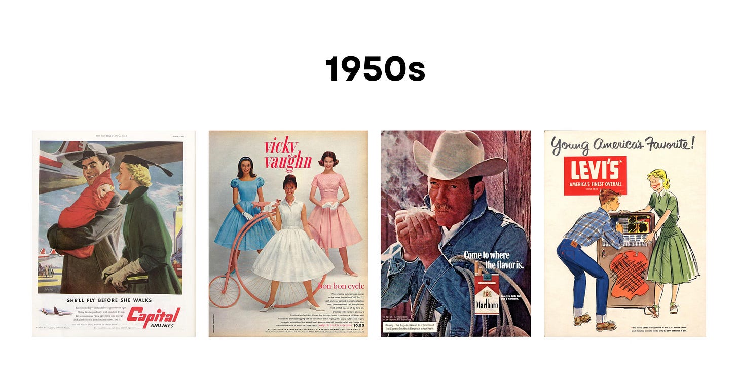
1950s
Key Elements: Big headlines + Sans-serif fonts + Catchy taglines + Themes of the American Dream + Glamorous photography + Charming characters and mascots + Triadic and pastel color schemes + Negative space + Symmetrical compositions
The ‘50s represent the Golden Age of Hollywood and America. It was also when the “baby boom” occurred. Record-breaking numbers of couples moved to the suburbs to buy homes and start families. The future was bright, and many citizens were optimistic.
The military invested in science and technology research, which “contributed to the decade’s economic growth.”4 Unique inventions and products arrived on the scene, leading to a renewed wave of consumerism. Portable televisions, pocket-sized radios, contemporary furniture, automatic appliances, and other time-saving gadgets were just the start.5
In the early 1950s, classic primary colors (red, yellow, and blue) reigned supreme. Negative space and symmetrical compositions placed the focus on the models. All were trim, proper, sophisticated, and stereotypically attractive.
Advertisers divided society into key demographics that they could analyze and target. Women were again encouraged to marry young, raise children, and tidy their homes all while maintaining youthful, glowing skin and the “perfect” figure. Beauty standards were incredibly unrealistic. Men aspired to emulate rugged characters like the “Marlboro man.” While children befriended charming mascots, teenagers were swayed by highly stylized campaigns that praised youth and all its glory.
Modern sensibilities eventually trended towards pastel color schemes: blush pinks, turquoise blues, and minty greens. This opened the door to the iconic 1960s aesthetic!
Stay tuned… There are 4 more decades to explore in Part 2 of this series! In the meantime, let us know which period inspired you most.


