

Color Psychology
Your favorite colors have special meanings! Let's uncover them below.


According to Science of People, human behaviors, emotions, and stress levels are influenced by hues.
But does every person see colors the same way? Not exactly. Age, memory, culture, and mood are key factors. Lightning and backgrounds are also important variables that determine how shades are observed.
Many researchers theorize that color perception is acquired after birth.1 As children grow, they may adopt universal patterns in color-emotion associations. However, those belonging to similar geographic regions or linguistic backgrounds, are more likely to share opinions.2
Artists infuse their works with brilliant colors. Some make their choices based on pure instinct. Others dig deeper, eager to discover hidden meanings.
Historical Color Theories
For over 2,000 years, ancient Greek philosophers like Aristotle thought in terms of four basic colors: white (light), black (dark), red, and yellow.3 Their theories were further inspired by the four elements of the natural world: water, air, earth, and fire.
Sir Isaac Newton is perhaps best known for his advances in physics and mathematics, but this prolific scientist built the foundations of modern color theory. While experimenting with prisms, he discovered that pure white light consists of red, orange, yellow, green, blue, indigo, and violet—the colors of the rainbow! Subsequently, he devised the world’s first color wheel, as published in his original novel Opticks (1704).
Around 1722, J.C. Le Blon published Coloritto, or, The Harmony of Colouring in Painting, which revolutionized modern color printing. His findings contributed to the RYB color wheel. While Newton focused on colored light and the additive color system, Le Blon explored “material colors” ever-present in books, paintings, or plants. Since these objects reflect varying amounts of light based on their chemical makeups, they belong to the subtractive color system.
Le Blon’s traditional subtractive primary colors—red, yellow, and blue—are applied to physical pigments, inks, and dyes. These combine to create secondary colors: violet, orange, and green. Tertiary colors emerge when equal amounts of primary and secondary hues are mixed.
While famous for his poetry and prose, Johann Wolfgang von Goethe took Newton’s results a step further in his treatise Theory of Color (1810). He developed “the first systematic study on the physiological effects of color.”4 Goethe’s version of the color wheel explored the subjective nature of hues. In other words, humans experience and interpret yellow differently than blue. Goethe claimed that “color is itself a degree of darkness” and should never be limited by analytical scientific measurements.5


There are 12 fundamental colors: red, yellow, blue, violet, orange, green, blue-violet, red-violet, red-orange, yellow-orange, yellow-green, and blue-green.
Researchers estimate that humans can see 1 million hues, but how is this possible? It turns out that numerous tints, shades, and tones descend from the first 12 hues.
Hue = a pure pigment
Tint = color created when you add white to any hue
Shade = color created when you add black to any hue
Tone = color created when you add white and black to any hue
Artists use these elements—along with lines, shapes, and textures—to create memorable visuals.
Remember:
Digital designers usually adhere to the additive RGB color model, which opens the door to more than 16.7 million hues!
When works are printed, they’re always created with the subtractive CMYK color model in mind. By layering cyan, magenta, yellow, and black inks, users can produce over 16,000 different hue variations!
Before modern scientific color theory, painters and art educators utilized the RYB color wheel. Red, yellow, and blue pigments are only the start!
The Meanings of Colors
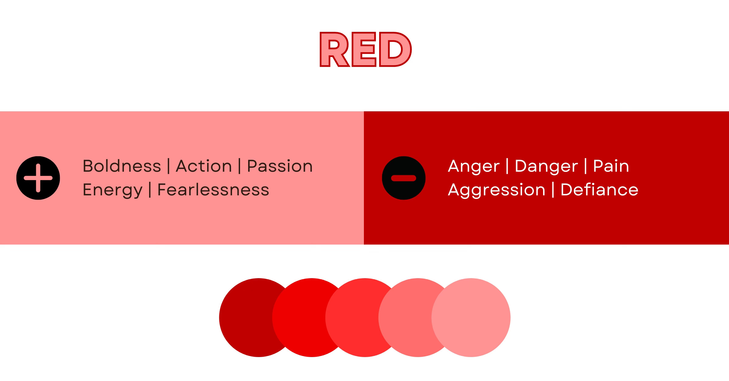
RED
Other Names: Cherry + Currant + Scarlet + Merlot + Garnet + Crimson
No wonder red is the most popular color for celebrations and holidays! Aside from boosting hunger, this vibrant hue represents a vast spectrum of emotions—from passion and ardor to anger and fearlessness. It’s also associated with danger or urgency. Stop signs compel most drivers to follow the law. Furthermore, companies typically prefer red for call-to-action buttons, convincing consumers to cross the finish line and buy.
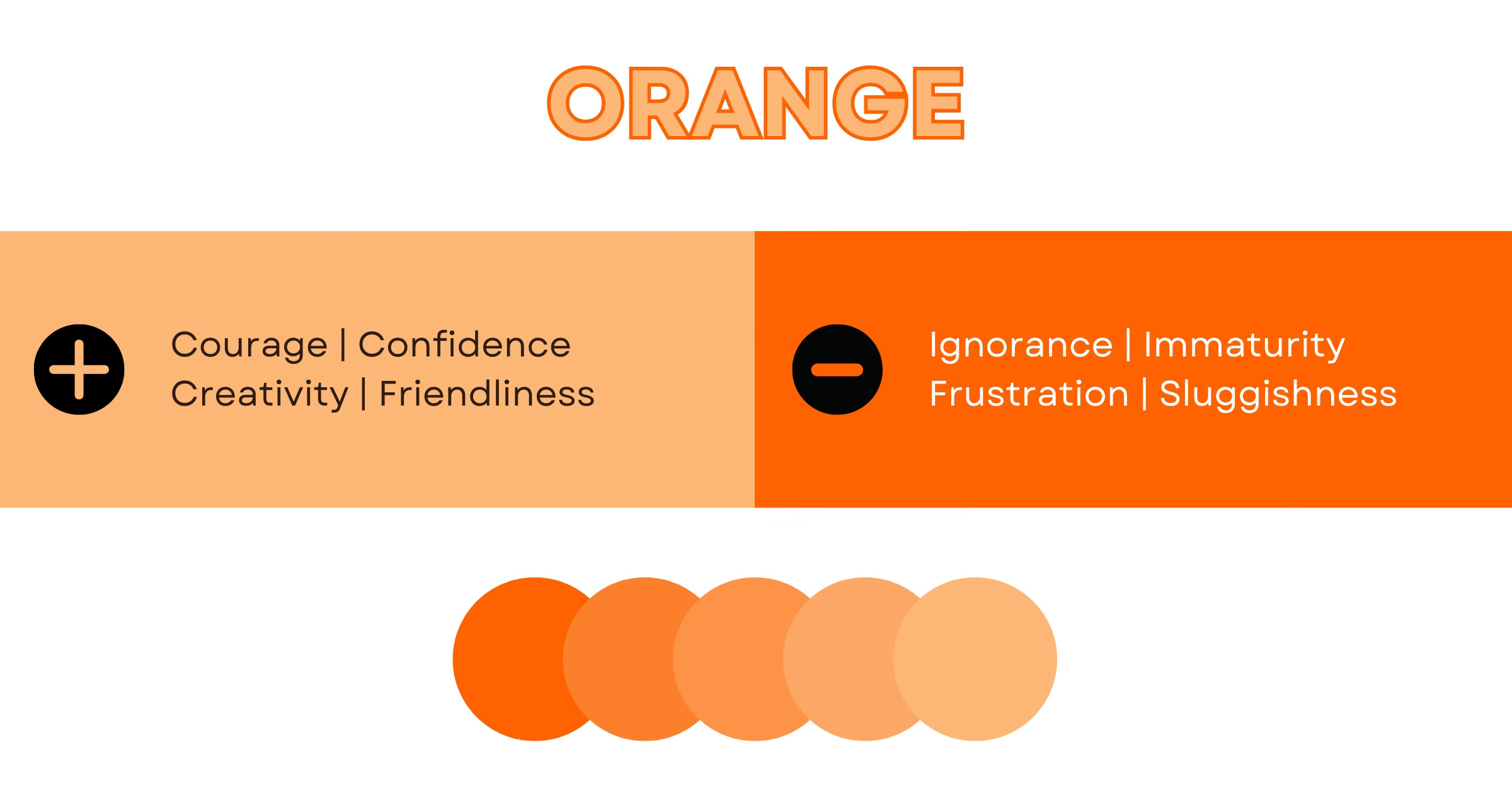
ORANGE
Other Names: Tangerine + Apricot + Carrot + Amber + Clay + Yam
Hoping to convey confidence, creativity, and courage? Then, orange may be your ideal color! While some associate the hue with immaturity and ignorance, some brands incorporate orange to evoke a sense of play or adventure.
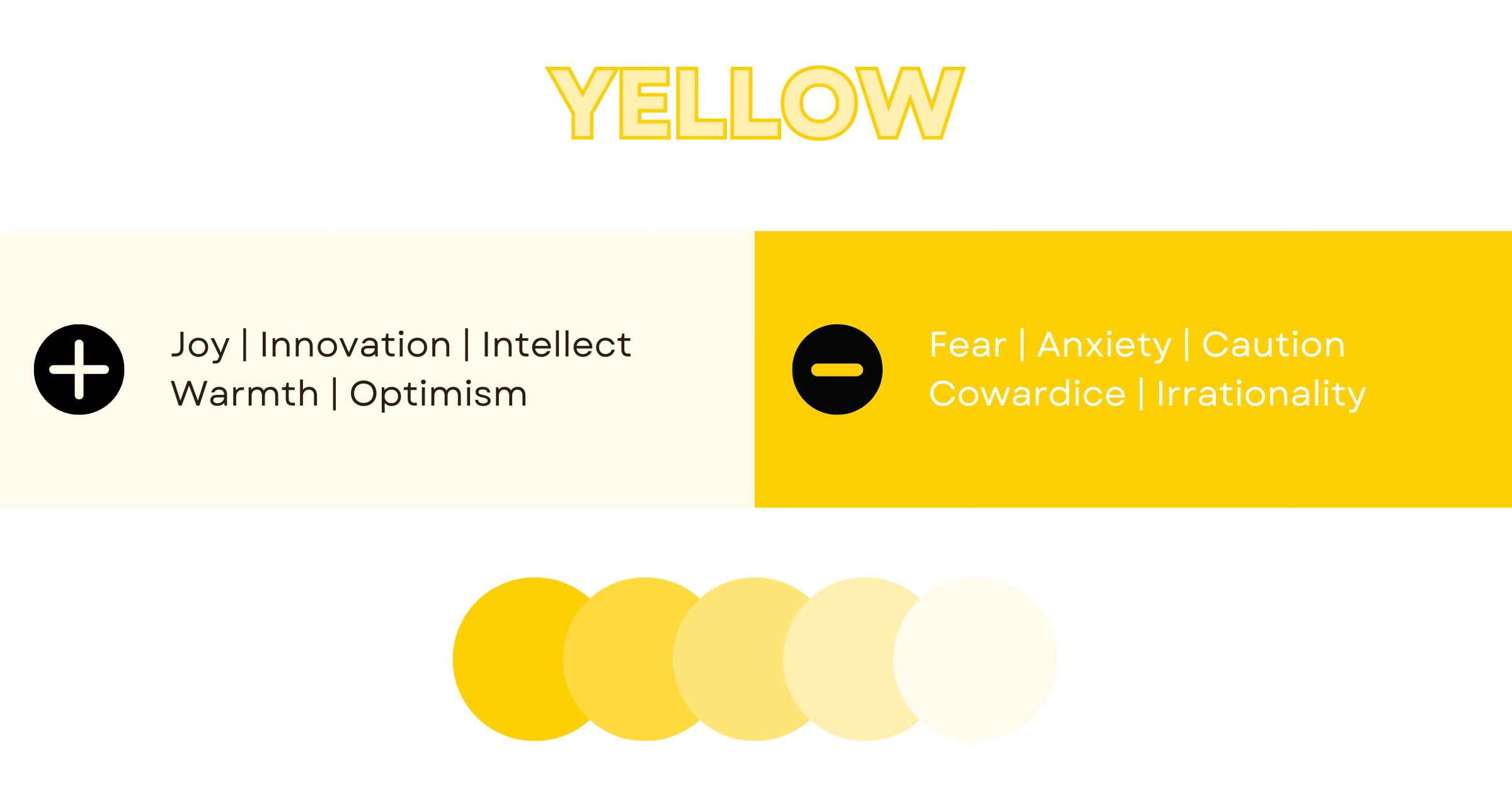
YELLOW
Other Names: Gold + Canary + Butter + Daffodil + Blonde + Mustard
If you ask a child to draw the sun, they'll likely color it yellow. This inviting hue symbolizes youthfulness and joy. Smiley faces, sunflowers, and rubber ducks are a few common manifestations. On the other hand, yellow caution tape or traffic lights warn people to turn back or slow down.
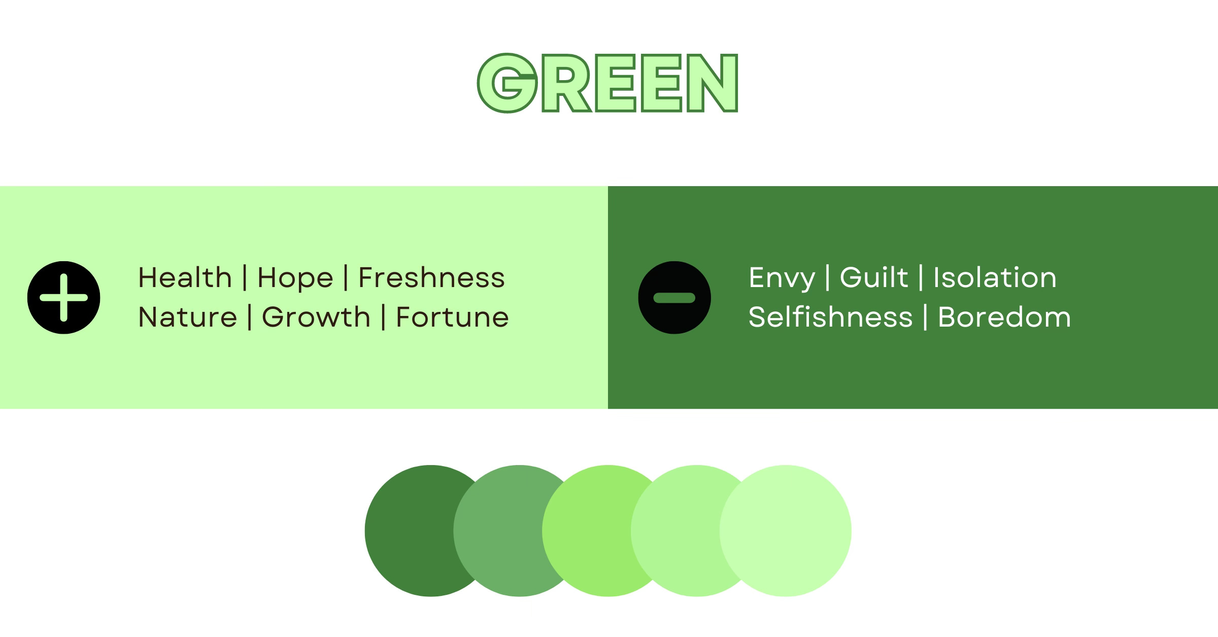
GREEN
Other Names: Chartreuse + Sage + Lime + Fern + Olive + Emerald
Green is the color of health, wealth, and fortune. In the context of the natural world, this hue represents vitality, freshness, growth, and renewal. Yet, some people turn green with envy. Depending on the shade you choose, green is incredibly versatile!
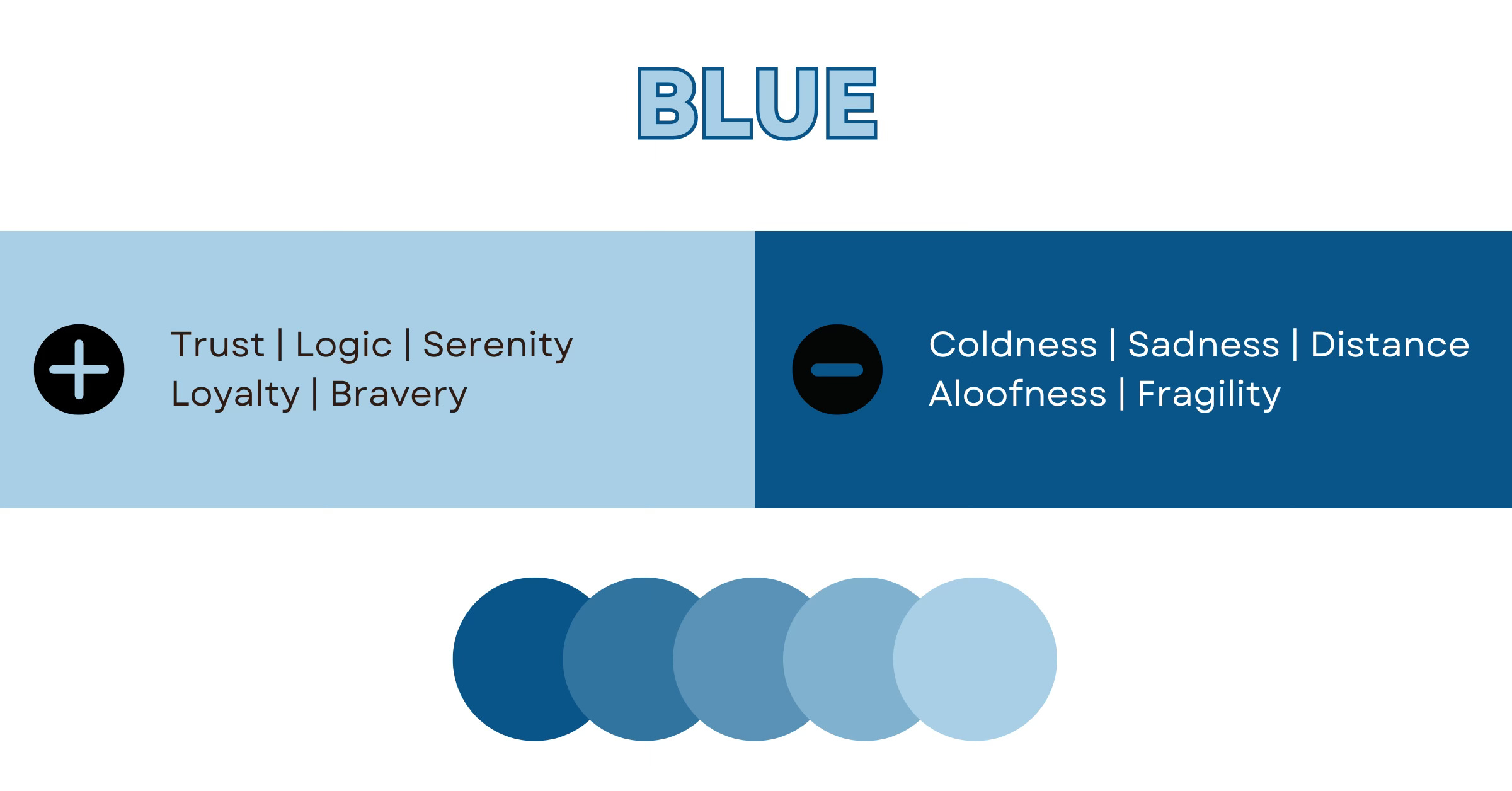
BLUE
Other Names: Cobalt + Azure + Cornflower + Turquoise + Sapphire + Navy
Did you know that blue is the most common color that humans see? When one imagines the open ocean or sky, this idea makes sense. Water and air are elements aligned with serenity. Many companies use blue in their logos to build a relationship with consumers based on loyalty, respect, and trust. However, it's a less common hue in grocery store or restaurant branding. Save for berries, blue is rarely present in food, so it's thought to suppress appetites.
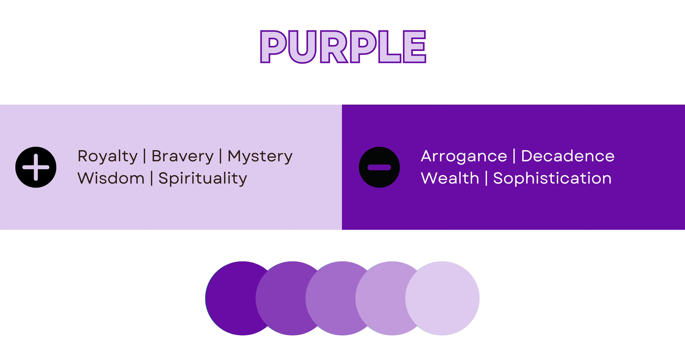
PURPLE
Other Names: Mauve + Violet + Lavender + Plum + Lilac + Eggplant
Since ancient times, royals have donned robes of purple. During the Bronze Age, the Phoenician city of Tyre produced gorgeous garments dyed with Tyrian purple. The Romans later adopted this pigment “as a symbol of imperial authority and status.”6 Natural sources of purple are rare and expensive, so the hue evolved to symbolize luxury. In the modern era, the cosmetics industry utilizes purple packaging for beauty and anti-aging treatments. Wisdom, wealth, decadence, and sophistication are additional emblems of the regal shade.
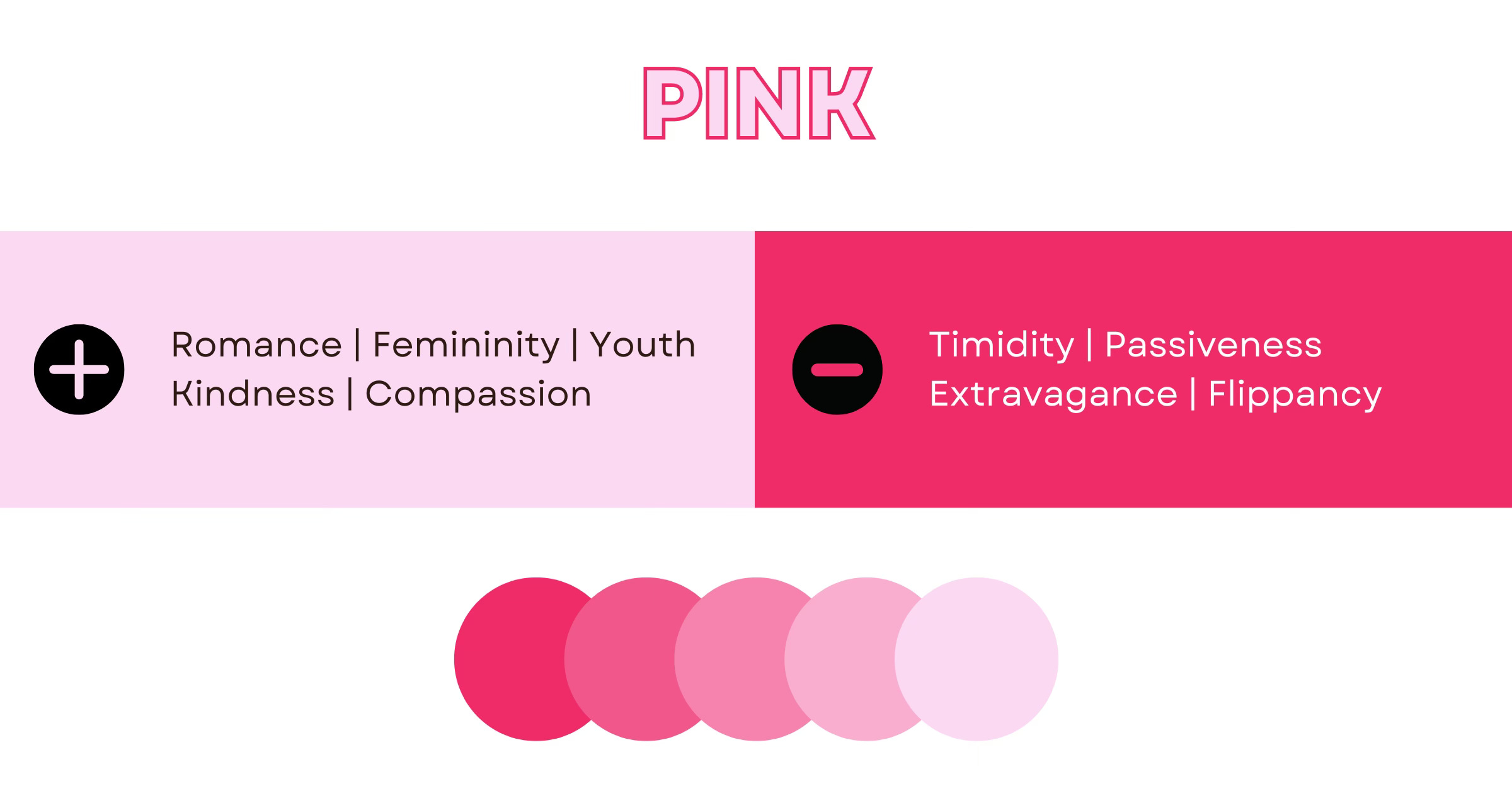
PINK
Other Names: Rose + Blush + Salmon + Watermelon + Bubblegum + Peach
How does one describe the color pink? It can be compassionate, romantic, youthful, or flirty. Leaning into magenta, this daring hue packs a visual punch. Save for T-Mobile and Barbie, pink is uncommon across brands. Most advertisers prefer it as an accent for emphasis. When used in large amounts, pink comes across as childish or extravagant.
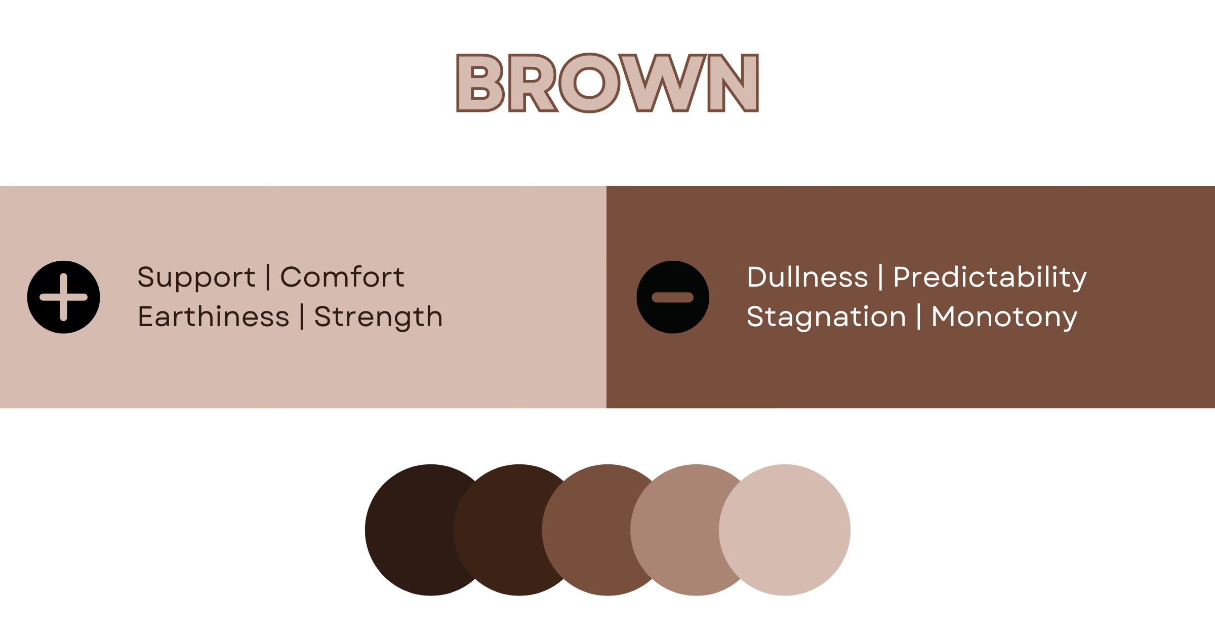
BROWN
Other Names: Carob + Pecan + Hickory + Walnut + Umber + Brunette
Brown is a grounding color that may remind people of soil, grains, beans, or trees. Others associate it with sweet chocolate or bitter coffee. Although brown is far less energetic than green, it can also imply comfort and reliability. The downside? Brown is seemingly everywhere, so it can invite feelings of stagnation or monotony.
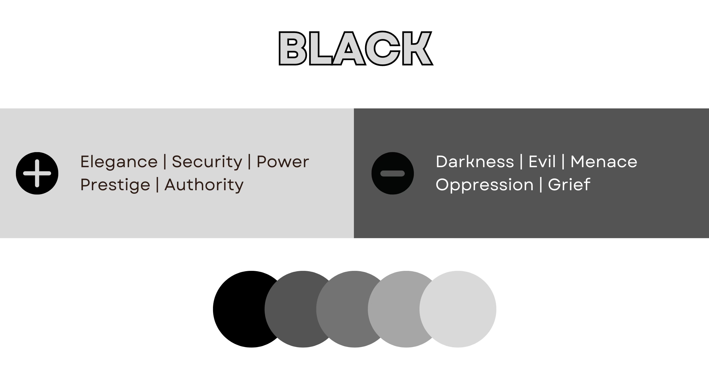
BLACK
Other Names: Ebony + Charcoal + Ink + Onyx + Sable + Obsidian
Some individuals associate black with death, decay, or evil. However, this universal shade is rife with meaning! At any major sporting event, security guards in black uniforms guard entrances. Cocktail party guests are likely to wear dark and refined gowns or tuxedos. Why? Black is widely associated with power, elegance, and authority!
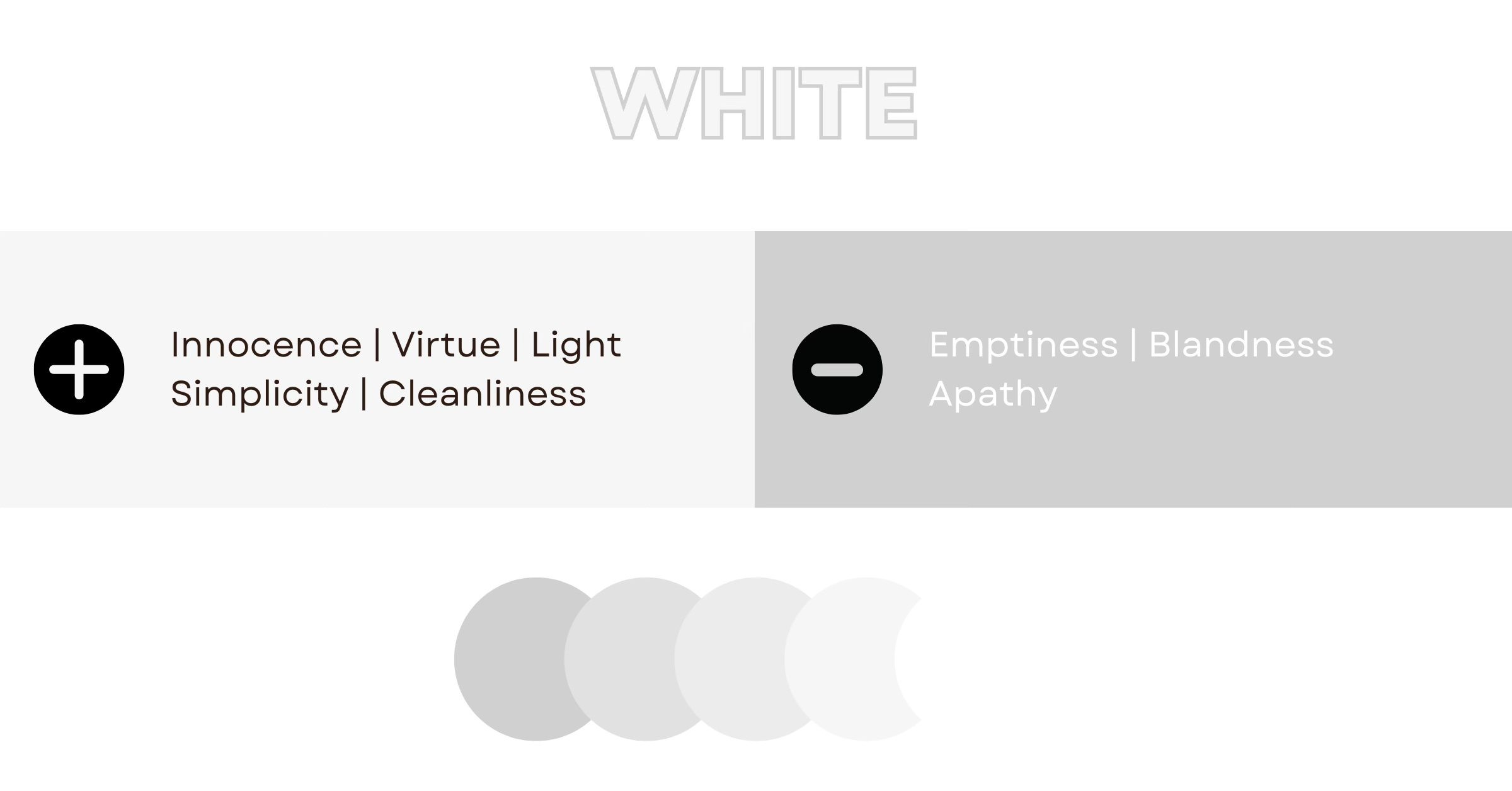
WHITE
Other Names: Pearl + Alabaster + Ivory + Cream + Chiffon + Linen
Angelic. Innocent. Pure. Pristine. These are common descriptors for white. One look at a blank canvas inspires an artist to explore, experiment, and create works of wonder. Some creatives may interpret white as being boring, safe, or simplistic. However, this hue’s bright and clean nature adds contrast, drawing viewers in for a closer look.
What is your favorite color to create with?
When combined, hues carry even more significance! In the next newsletter, we’ll explore how unique palettes make an impact.
Benson, J. L.. “Greek Color Theory and the Four Elements [full text, not including figures].” (2000).