How did our ancestors share words? Originally, they were written by hand across pottery, animal hides, wood, tablets, papyrus, and parchment.1 Early storytellers depended on a variety of implements ranging from charcoal to ink.
Thanks for reading Smolder! Subscribe for free to receive new posts and support our work.
A Brief History: The Evolution of Writing & Printing
c. 3,200 B.C.: Cuneiform script emerged in ancient Mesopotamia.
c. 3,000 B.C.: Egyptian hieroglyphs came into existence.
c. 1,850 B.C. - c. 1,450 B.C.: Centered on the island of Crete, the Minoan civilization developed Linear A script.
1,600 B.C. - 1,046 B.C.: A system of writing was founded in China during the Shang Dynasty.
c. 1,500 B.C. - c. 1,200 B.C.: In Ancient Greece, the Mycenaean civilization utilized the Linear B script.
1,100 B.C.: The Phoenician alphabet was introduced.
c. 800 B.C.: The Greek alphabet first appeared. It is considered the direct or indirect ancestor of current-day European tongues.
c. 700 B.C.: Latin followed Greek.
From the seventh century on, block printing increased in popularity. This tedious method—refined during the Tang Dynasty in China—required artisans to carve designs into wood, apply ink to the surface, and stamp onto various materials. For centuries, only the wealthiest classes could afford books.
When German goldsmith, gem cutter, and metallurgist Johannes Gutenberg invented the printing press in the mid-1400s, the world changed.2 A Latin print of the Bible was his first successful project. Although only 22 original copies remain today, Gutenberg’s legacy persists. Books were printed with more efficiency. Poorer citizens learned how to read. And knowledge of religion, science, art, culture, and general education was widely disseminated.
It is important to note that movable metal type printing was invented in Goryeo, Korea. Although this technique predates Johannes Gutenberg’s famed press, his innovations popularized the art of printing.
The Importance of Fonts
Derived from the Latin fundere—“to melt, cast, pour out”—the term font represents more than “an assortment or set of type or characters all of one style and sometimes one size.”3
Fonts are central to the work of writers, artists, and graphic designers. Here are some of the purposes they serve:
Create mood and atmosphere - Type elements like strokes, serifs, ascenders, descenders, and the like contribute to unique designs that inspire emotions. Some describe them as whimsical, trustworthy, friendly, or aspirational. However, most students, researchers, and scientists prefer a simple style without embellishments.
Demonstrate visual hierarchy - Navigation is essential. Without it, a clear stream of communication is muddled. If readers don’t know where to focus, they may grow confused and frustrated, ultimately misunderstanding the author’s true intentions. Headings, subheadings, and body text provide organization along with visual appeal. Similarly, bold and italicized words offer emphasis, guiding viewers’ eyes across lines of text.
Influence reading times - Some fonts are easier to read than others. Professors prize Times New Roman for its accessibility and legibility. An essay or novel typed in Impact would be difficult to read and process. See below!
Fun Fact: When you search for a font on Google, the results appear in the same style. Here is an example of Impact.
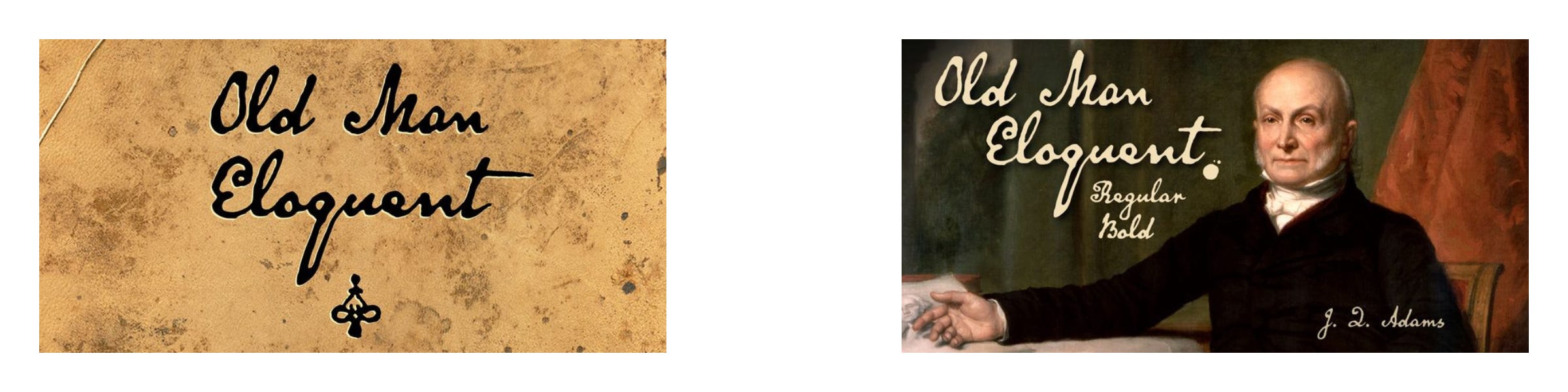
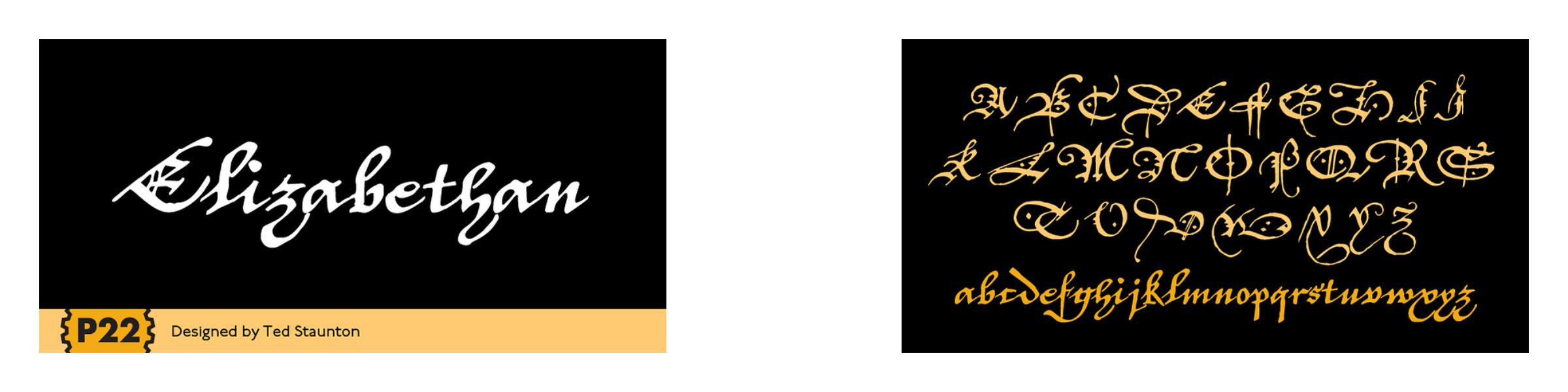
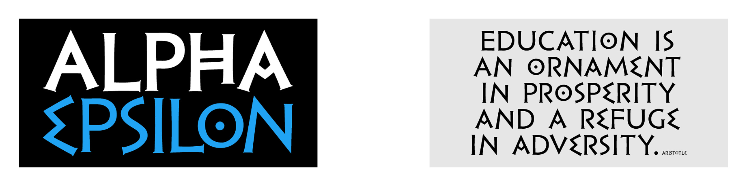
Old-Style Fonts
Do you ever wonder what previous centuries were like? Step back in time with these masterfully designed typefaces. They evoke the magic and mystery of the past.