

7 Fundamentals of Design
What do all designs have in common? The seven fundamentals! Wield them and create art that stops the scroll.


What comes to mind when you think of the word “design”?
One version of the term is active, as in “to create, fashion, execute, or construct according to plan” or “to conceive and plan out in the mind.”1
There are no limits to what you can design. Logos, business cards, flyers, movie posters, pitch decks, and websites are just a few possibilities. Beyond striking visuals and promotional materials, you can also design houses, clothes, sunglasses, or perfumes.
No matter the field, design requires imagination and action. But how does one cross that bridge?
Learn the fundamentals.
Without a solid foundation, it’s difficult to reach soaring heights.
Chefs must master the four elements—salt, fat, acid, and heat—to invent mouthwatering recipes.
In anticipation of their first draft, writers prioritize the mechanics of language: grammar, punctuation, spelling, and vocabulary.
Before we can begin to understand the principles of design, it’s essential to examine the basic building blocks: Space, Form, Line, Shape, Color, Value, and Texture.

In graphic design, space refers to the areas around, between, and within objects. It’s relative.
A blank canvas (tabula rasa) consists of 100% negative space, but it doesn’t always have to be white. The moment you introduce a minuscule dot of paint or ink, that percentage decreases.
Shapes and or forms occupy positive space. As the central focus, they stand in stark contrast to a neutral background and engage viewers.
A skilled use of space can achieve visual balance and hierarchy. We can take this a step further by challenging perspectives with optical illusions.


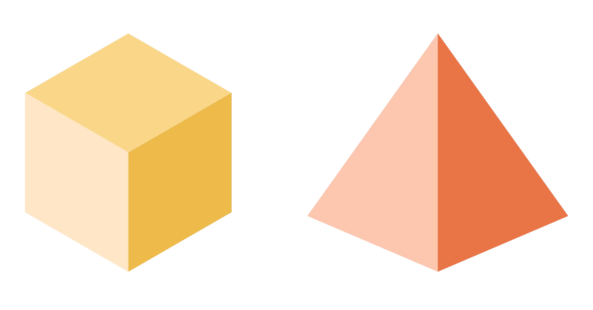
A form fills the designated space. It’s the focal point of any image.
On flat surfaces, designers can manipulate light, shadow, and contours to elevate dimensionality—beyond the page or screen.

How do you connect two points in space? A line, of course. The method doesn’t matter. It can vary by directionality (horizontal or vertical), weight (thick or thin), length (short or long), and texture (dashed, dotted, or wavy).
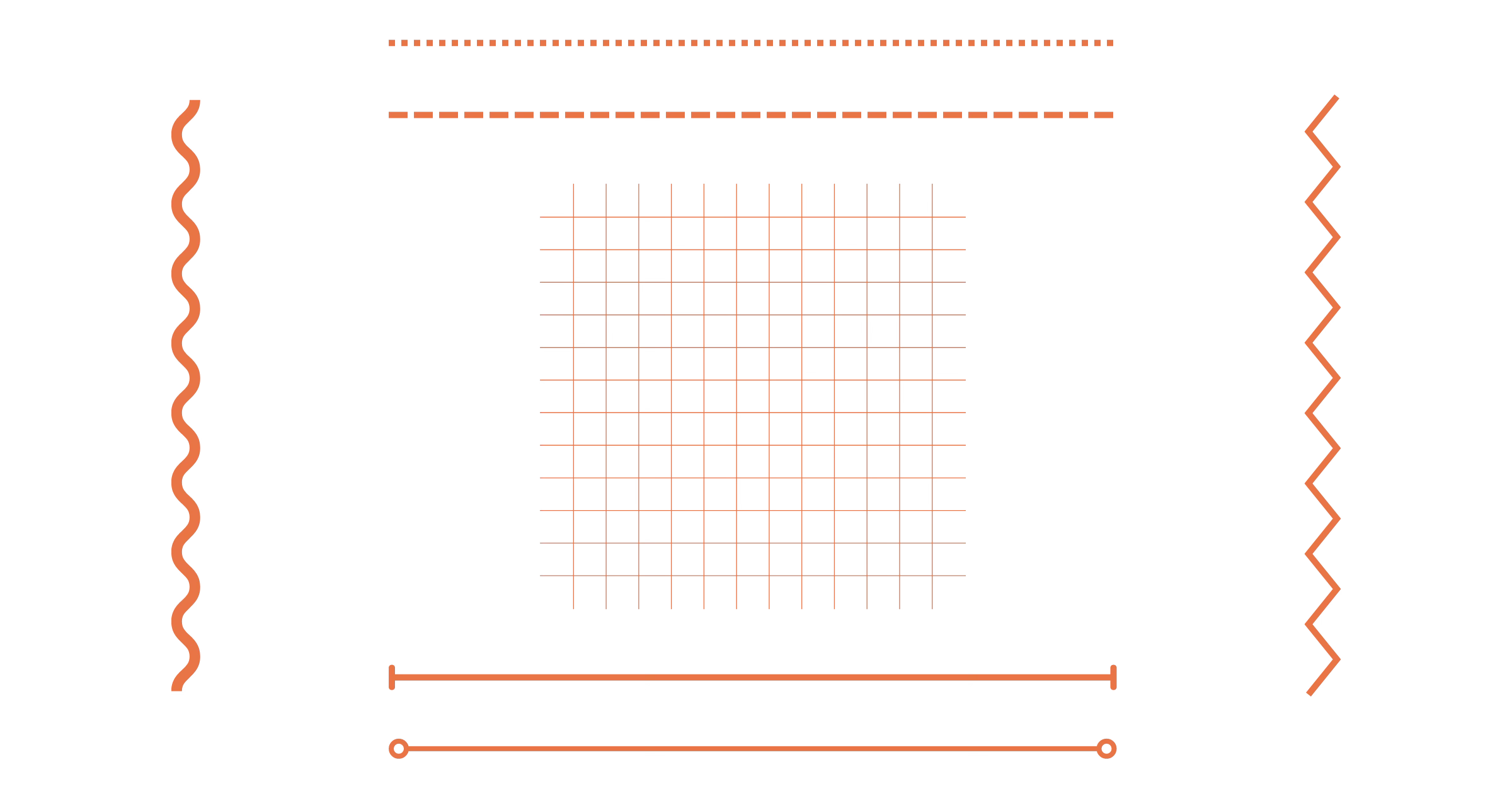
In a broader sense, lines—visible or invisible—can provide momentum, structure, connection, and order. Even if implied, lines guide our eyes across the image toward the subject. This usually occurs at the subconscious level. For example, when we observe the Little Dipper in the night sky, it’s not just a random cluster of stars. We connect dots to glimpse the full picture!

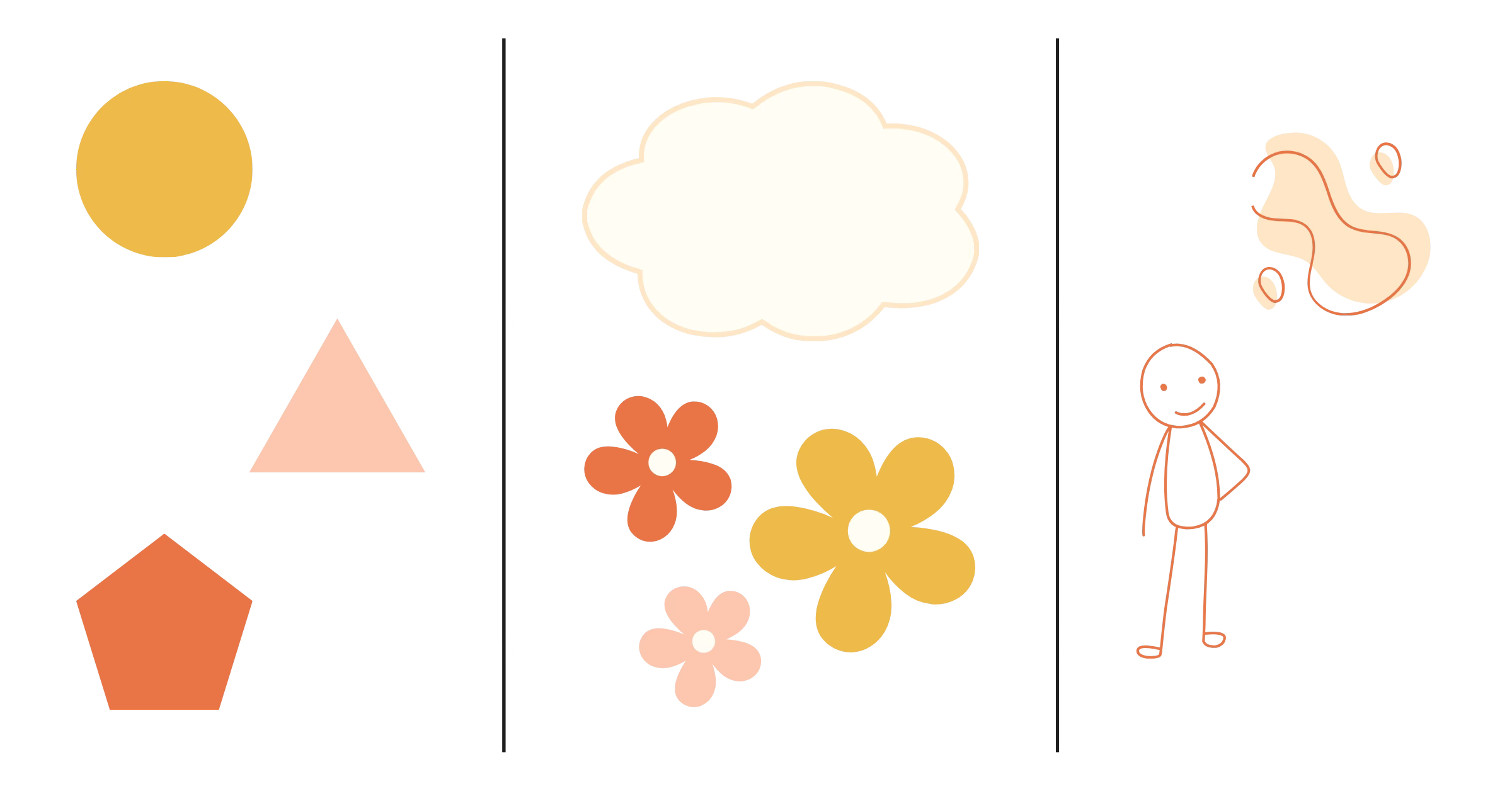
Lines lead to shapes. A shape defines the outline or boundary of an object. There are three different types: geometric, organic, and abstract.
Geometric shapes are precise, mathematical, and regular. They’re determined by the number of sides. Circles, triangles, squares, pentagons, and hexagons are some familiar examples. If you change the length of each edge, then the shapes become increasingly irregular. Concave and convex angles also matter!
Organic shapes are asymmetrical and occur in the natural world. You might recognize them as free-flowing clouds, trees, flowers, and rocks.
It’s most difficult to classify abstract shapes. They’re the most basic representations of reality. For example, a simple stick figure symbolizes a human being while a light bulb icon alludes to a bright idea.
Have you heard of shape psychology? Many people associate shapes with certain moods and emotions:
Circles = Unity + Timelessness
Squares = Stability + Balance
Triangles = Energy + Excitement + Action

Color is reflected light. And yellow is the most visible on the spectrum. Thankfully, we don’t have to train as physicists to understand the magic of color theory.
Red, yellow, and blue form the foundation of the painter’s color wheel. They lead to secondary colors: orange, green, and purple. When equal amounts of primary and secondary colors are blended, tertiary colors emerge. In total, there are 12 main hues: red, yellow, blue, orange, green, purple, red-orange, yellow-orange, yellow-green, blue-green, blue-violet, and red-violet.
There are two more color models to examine: RGB and CMYK.
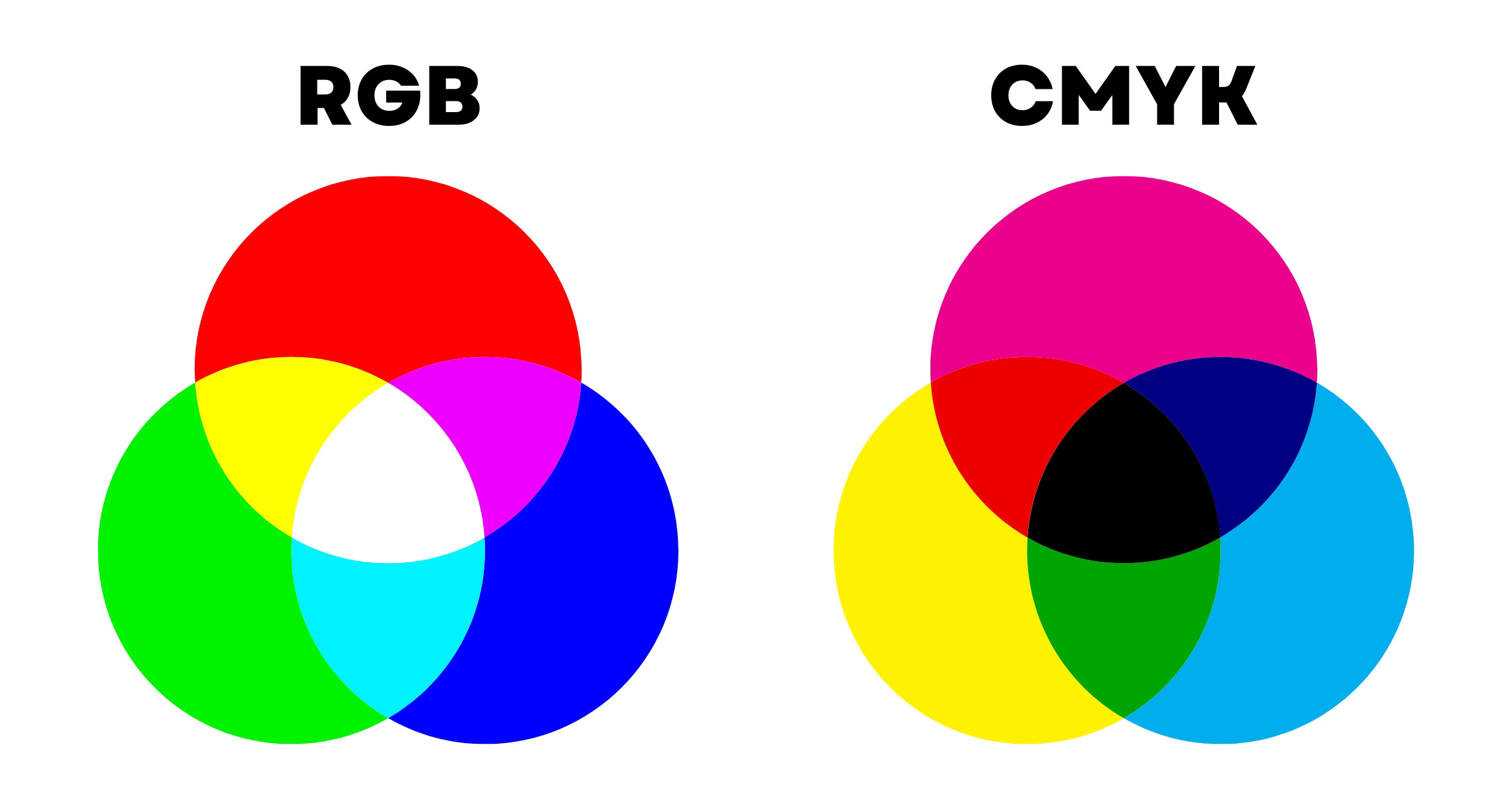
Intended for digital devices and light-based media, the additive RGB color model classifies red, green, and blue as primary colors. Equivalent measures of these bases lead to pure white. Based on this principle, secondary colors consist of cyan (green and blue), magenta (blue and red), and yellow (red and green). Orange, chartreuse green, spring green, azure, violet, and rose comprise the tertiary colors. With 16.7 million hues available, the possibilities are seemingly endless.
The subtractive CMYK color model is optimized for printed designs like stickers, business cards, stationary, signs, or any other product that requires ink. Black is created from equal parts cyan, magenta, and yellow. The secondary colors are red, green, and blue. Do you recognize the pattern? By layering colors of different intensities, this process can create 16,000 unique hues.
Remember: Before you set up your design file, it’s important to consider your final product. How and where will it be seen? Always start in the correct color mode: RGB or CMYK!
What if you want to change a color’s purest form? There are simple formulas for that! No math is required.
Hue = Pure Color
Tint = Hue + White
Tone = Hue + White + Black
Shade = Hue + Black
Choosing the right color combination is a blend of art and science. Depending on your end goal, there are several options. Here are a handful to get you started:
Monochromatic Colors: Achieve harmony by combining at least three shades, tones, and tints of one base color.
Analogous Colors: Unify your design with neighboring colors on the color wheel.
Complementary Colors: For high contrast and impact, choose colors on opposite sides of the color wheel.
Triadic Colors: Select three colors that are evenly spaced on the color wheel for bold and vibrant palettes.
Pro tip: Use the free Adobe Color tool to create magnificent color themes! Learn more about color palettes here.

Value represents “the darkness or the lightness of an object in a composition or document.”2 It can be measured on a scale varying from 1% to 100% black. Value shifts often create mass, contrast, readability, and the illusion of form.


You can’t reach across a page or screen and touch a virtual object, but it’s possible to create a convincing illusion by imbuing your design’s surface with texture. It can be rough, smooth, ribbed, and the list goes on. Patterns are another way to stimulate viewers' senses and enhance visual interest.


All art is subjective, and it’s impossible to please everyone.
The good news? You have the power to stop people in their tracks with stunning visuals.
With proper implementation of design's seven fundamentals—Space, Form, Line, Shape, Color, Value, and Texture—you can craft a memorable sensory experience and raise brand awareness.
The journey does not end here. Next week, we’ll discuss key principles that impactful designs share.