


4 Logo Variations for a Memorable Brand Identity
Designers can’t predict the future, but we can prepare for success. Here are 4 logo variations for crafting a memorable brand identity.


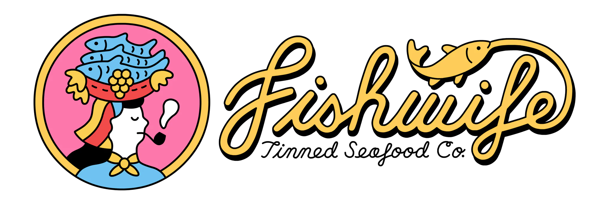
All businesses—whether they provide a product or service—strive to build a loyal audience. This starts with memorable branding, especially a logo. More than an eye-catching design, this is the unique symbol or design used to identify an organization and, by association, its offerings. Styles range from abstract and figurative to literal.
ABSTRACT/FIGURATIVE LOGOS:
NIKE is a global brand specializing in athletic footwear and apparel. Its world-renowned swoosh symbol loosely depicts the wing of the Greek goddess of victory, also called Nike. This symbolizes speed, power, motivation, and motion, specifically flying. (Everyone wants to fly high and prosper.)
Slack is a cloud-based team communication platform. Beyond the artistic shapes and bright colors, its multi-colored logo resembles a hashtag. Although abstract, this icon represents the company’s core tenets: collaboration, productivity, and innovation.

LITERAL LOGOS:
Burger King is a multinational chain of hamburger fast-food restaurants. Its burger logo is instantly recognizable. The contrasting colors—red for the text-filled patty and yellow for the bun—attract wanted attention.
Dunkin’ is a multinational quick-service restaurant chain known for its signature coffee and breakfast items. Its traditional pink and orange logo features a steaming cup of coffee with twin D’s.

Logos are displayed across digital and print media, but the formatting specifications vary. For example, one company may require several logo variations on social media, websites, stickers, flyers, business cards, and billboards.
Even if a business prioritizes digital marketing, networking platforms—including Instagram, Facebook, X, and Substack—have different image and video guidelines. Sometimes, the possibilities are overwhelming.
Designers can’t predict the future, but we can prepare for success by planning a brand’s primary logo, secondary logo, submark, favicon, and accompanying elements.
1) PRIMARY LOGO
Placement: Desktop website header, social media cover photos, large signs, billboards
The primary logo always leaves the first impression. As a company’s most widely recognized symbol or design, it commonly showcases the full name, color palette, typography, tagline, and key elements—most notably custom icons, symbols, or illustrations.
An effective primary logo immediately orients prospective customers, establishing parameters and answering key questions. Who is served? What services are provided? Where does the business operate? When was it founded?

2) SECONDARY LOGO
Placement: Business cards, invoices, envelopes, email signatures, promotional items
The secondary logo is a simplified version of the primary logo. While preserving the brand’s theme, it provides more flexibility across media—especially social media!
This logo variation summarizes a company's top features (e.g., name, service or product, and location). Additionally, the frame—the shape or orientation in which the information appears—changes from one type of logo to another. If the primary logo is horizontal and rectangular, the secondary logo could be vertical and square.


3) SUBMARK
Placement: Social media profile photos, website footers, watermarks, and small merchandise (i.e., pins, patches, or stickers)
A submark is small but mighty! This tertiary logo is best for more limited spaces. If text is included in the minimalist design, it’s usually limited to a company’s name or initial(s). The circle, which fits perfectly inside profile photos, is a popular frame for submarks.

4) FAVICON
Placement: Website search bar
When you scroll through search results or visit a website, you’ll most likely spot a brand’s favicon. It displays the most iconic symbol—typically a tiny illustration or letter—with no more than 2-3 high-contrast colors.
The favicon may be a minor detail to some, but to others, it can make the ultimate difference! Besides building brand recognition, it promotes consistency across platforms and devices.
According to Squarespace1: “Favicons play a significant role in SEO. While they might not directly influence search rankings, they can have indirect benefits. By making your site easily identifiable and accessible, favicons encourage visitors to explore, revisit, and ultimately stay longer. This improved user engagement contributes to a stronger online presence and better search optimization.”

BONUS: BRAND ELEMENTS
Placement: Website backgrounds, digital action buttons, social media highlights, packaging (i.e., tissue paper or boxes)
Brand elements may include illustrations, patterns, textures, or even themed photographs. Although optional, they add visual interest and convey a company’s values, vision, and personality.


The modern marketplace is competitive.
How does one business stand out from the next? Original logos, brand elements, taglines, color palettes, and fonts. Although individually significant, they serve an even greater purpose together.
Cohesive branding inspires a bigger-picture mindset. Instead of passively observing, potential customers actively participate in a meaningful narrative. While some brand stories have lasted for generations—consider Coca-Cola, Harley-Davidson, UPS, and L.L. Bean—other companies are in the first chapter of their journeys. Never forget: there are many more riveting tales to tell.