

10 Principles of Design
Take your designs to new heights with 10 core principles that innovative artists follow—and sometimes reimagine!


According to legendary industrial designer, Dieter Rams, “good design” makes a product useful and understandable. It’s also innovative, aesthetic, unobtrusive, honest, long-lasting, thorough (down to the last detail), environmentally friendly…and involves as little design as possible.
Like other creative disciplines, design is subjective. You can’t measure quality with a ruler or calculator, but you can follow the principles of design. For the purposes of this article, 10 will be investigated: Balance, Contrast, Emphasis, Repetition, Pattern, Rhythm, Movement, Proportion, Variety, and Unity.
Once you understand the fundamentals, it’s easier to bend the rules and experiment. The possibilities are endless.

Designs carry visual weight. This is determined by form, size, color, and texture.
Since heavy elements are thick, bold, and dark, they easily attract the eye. With too many in play, a composition can feel chaotic and disorganized. Light elements occupy less space and support the primary subject.
If you strike a balance between the two, your message will be clear and concise.
Symmetrical balance is evident when objects on either side of a central axis—vertical or horizontal—carry equal visual weights. Here are some examples:
A design with bilateral symmetry is split in half to form two mirror images.
If identical elements are copied across a central line or axis, reflectional symmetry is observed.
When a duplicated shape is moved in a specific direction over a measured distance—without any rotation or reflection—it's called translational symmetry.
Radial (rotational) balance is exceedingly common in nature. Imagine the sun’s rays or a flower’s petals emanating from a central point! When rotated, they maintain position.
While symmetrical compositions are harmonious, they can also be static and predictable. Asymmetrical balance pushes boundaries by incorporating two different halves or parts.


With two or more unique visual elements in a design, there’s a clear contrast. Here are some familiar examples:
Light vs. Dark
Thin vs. Thick
Bright vs. Dull
Contrast is essential to establish hierarchy, control visual flow, and improve accessibility.
Start experimenting with shape, scale, color, layout, texture, or typography. You’ll never know if a combination works unless you try. Sometimes, opposites do attract.
Just remember to give your most important feature the highest contrast. If there are too many extremes across the work, it can confuse viewers.


While contrast juxtaposes two different objects, emphasis is dedicated to the impact of one. It could take the form of a headline, image, or call to action button.
In the previous newsletter, we explored the 7 fundamentals of design. Among them, lines, shapes, colors, textures, and spaces can be manipulated to draw in audiences and designate a mesmerizing focal point.
Contrast also helps. The “subscribe” button on Substack is a great example. If you want to convert visitors to subscribers, then you can grab their attention with a bold button that stands out against a neutral background. The emphasized design element inspires users to take action with a click!


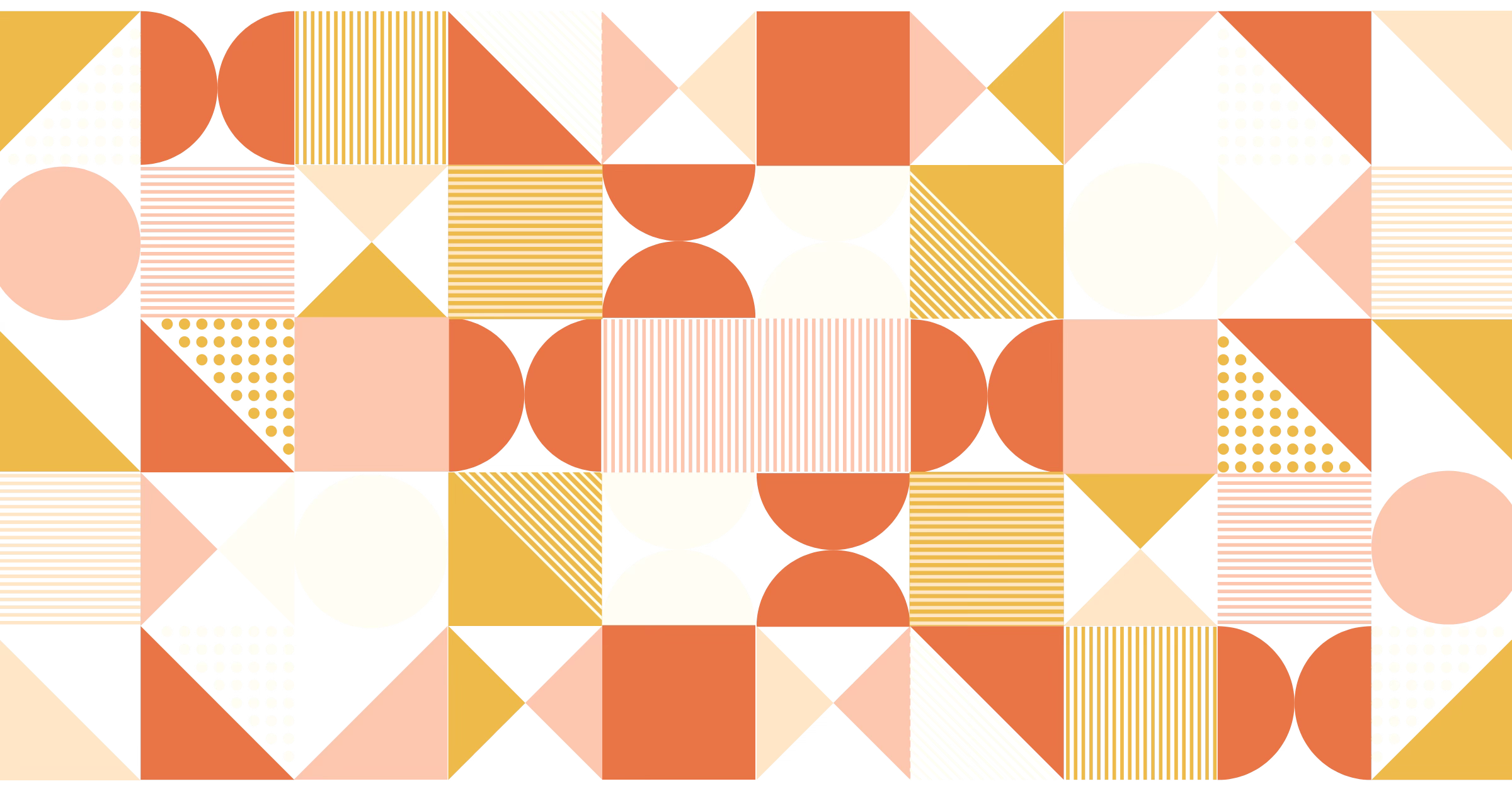
It’s no surprise that repetition happens when a motif—line, shape, form, color, etc.—recurs across the field of view. This leads to cohesive designs that soothe and stimulate while commanding attention.


A pattern multiplies the effect of repetition. Instead of a singular design element, several motifs of varying colors, textures, and shapes are repeated.


Need more action and movement across your design? Then, rhythm is your answer. It usually involves the repetition of lines, shapes, colors, and other features with slight variations over time and space. You can choose from the following options:
Random rhythm: Elements repeat without predictable intervals.
Regular rhythm: Elements of similar sizes and lengths are organized over regular intervals.
Alternating rhythm: Two separate elements repeatedly switch back and forth. This is exemplified on a chessboard with its signature black and white tiles.
Flowing rhythm: Elements or patterns repeat over organic intervals that mimic those in the natural world. They may replicate bends, curves, and undulations as observed with ocean waves or dunes.
Progressive rhythm: Over a series of steps, elements or patterns consistently shift. The first element will differ from the last. This occurs in gradients.


Rhythm guides perspective. Unlike emphasis, it doesn’t prioritize one object. It inspires viewers to follow the natural flow from one to another.

When users view your composition, their eyes follow a path. This process is movement.
Under a designer’s influence, people are encouraged to see in new ways. They may unknowingly follow visual patterns.
F- and Z- patterns are optimized for image-heavy layouts. The opposite is true for the layer cake pattern, intended for block-heavy pages divided by headings, subheadings, and body text.
The illusion of action can be sustained with curved or diagonal lines, high key to low key hues, repetition, and contrast.

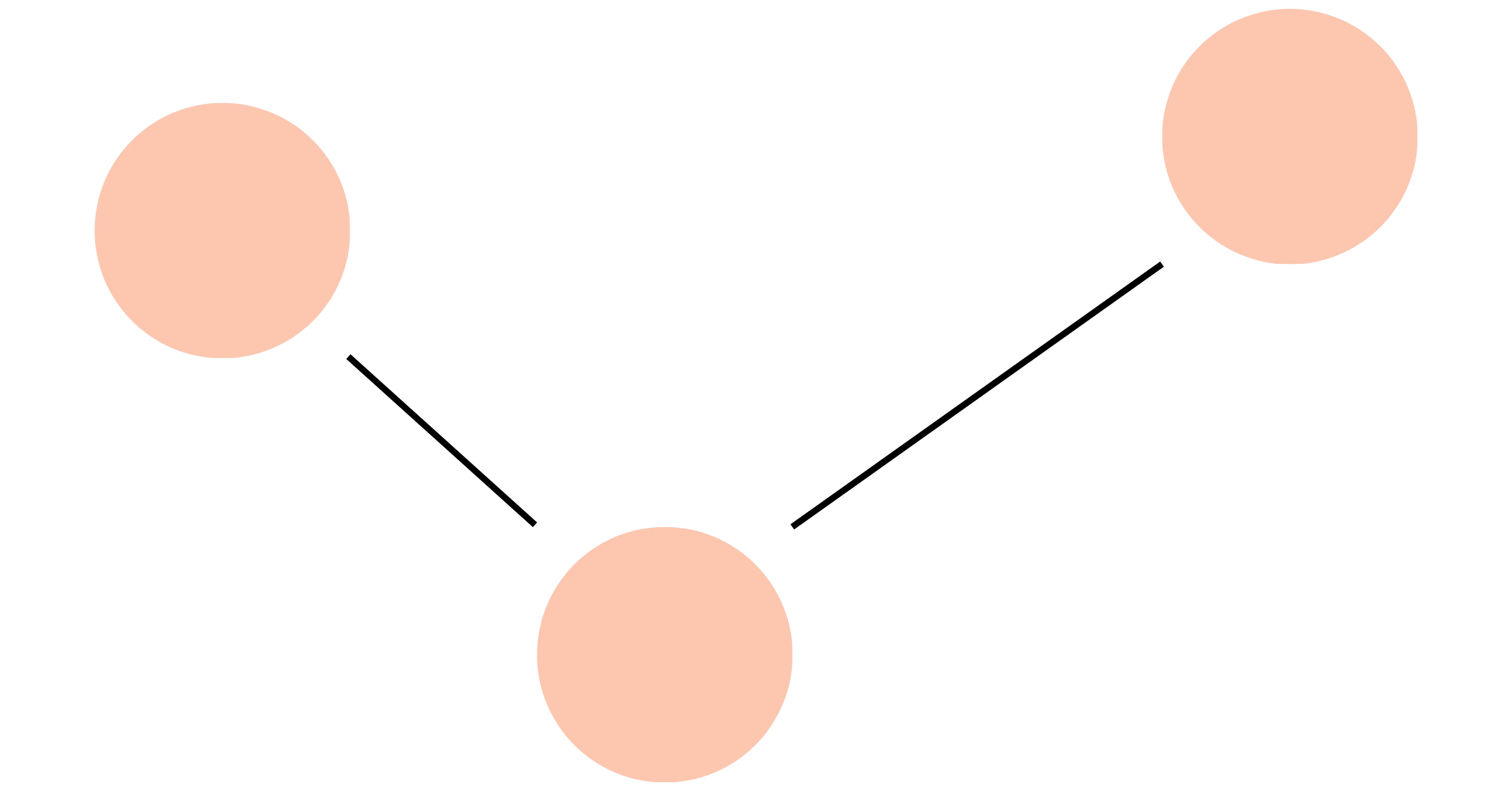
Proportion is the relationship between two or more elements of varying sizes and/or scales.
It's common knowledge that a cat is bigger than a mouse or a tree is taller than a person. Your renderings don’t have to be 100% accurate, but they should be aesthetically pleasing. If a scene appears off, then audiences will be distracted by the dissonance.
Our goal as designers? Suspend their disbelief and find harmony.


Keep viewers on the edge of their seats with variety.
No one likes monotony. Life is more exciting with unexpected twists and turns!
Design is no different. Why would someone come back for more if they already know what to expect?
These days, it’s especially difficult to hold a person’s attention. Adding visual tension with contrasting shapes, textures, lines, colors, and fonts helps to enhance variety!

As the Greek philosopher Aristotle once mused, “The whole is greater than the sum of its parts.”
What sage advice. The interaction between parts generates interest.
When a design’s elements come together for a specific purpose, unity is achieved. And where there is unity, there is the appearance of oneness and resolution.
When branding is cohesive, paragraphs of text are unnecessary. Good design should speak for itself.
Brightland does this well. Their personality comes through with a vibrant color palette: playful red, green, and yellow hues accompanied by soft neutrals. Although shapes vary across bottle labels, customers are guaranteed fun, abstract designs with dynamic energy.
People don’t just buy Brightland’s products—oil, honey, and vinegar—for their exquisite taste. Of course, that matters, but they’re willing to pay a premium because a quality culinary experience is promised.


People are exposed to around 4,000 to 10,000 ads per day. You only have precious seconds—usually 8-10 based on the “rule of customer attention”—to stop viewers in their tracks.
With the principles of design, we can! Which is your favorite? Let us know in the comments below!