Color Scheme Inspiration
Discover a color palette that enriches your brand and life!


Do you need a color palette for a special occasion or project? Where should you start? How do you find “the one” for your newest venture?
If you’re feeling a little lost, we can help you find your way in the vast world of color.
Color Science
There’s a science to color, and it’s far from boring. Isaac Newton’s original color wheel demonstrated the existence of 3 primary colors, 3 secondary colors, and 6 tertiary colors.
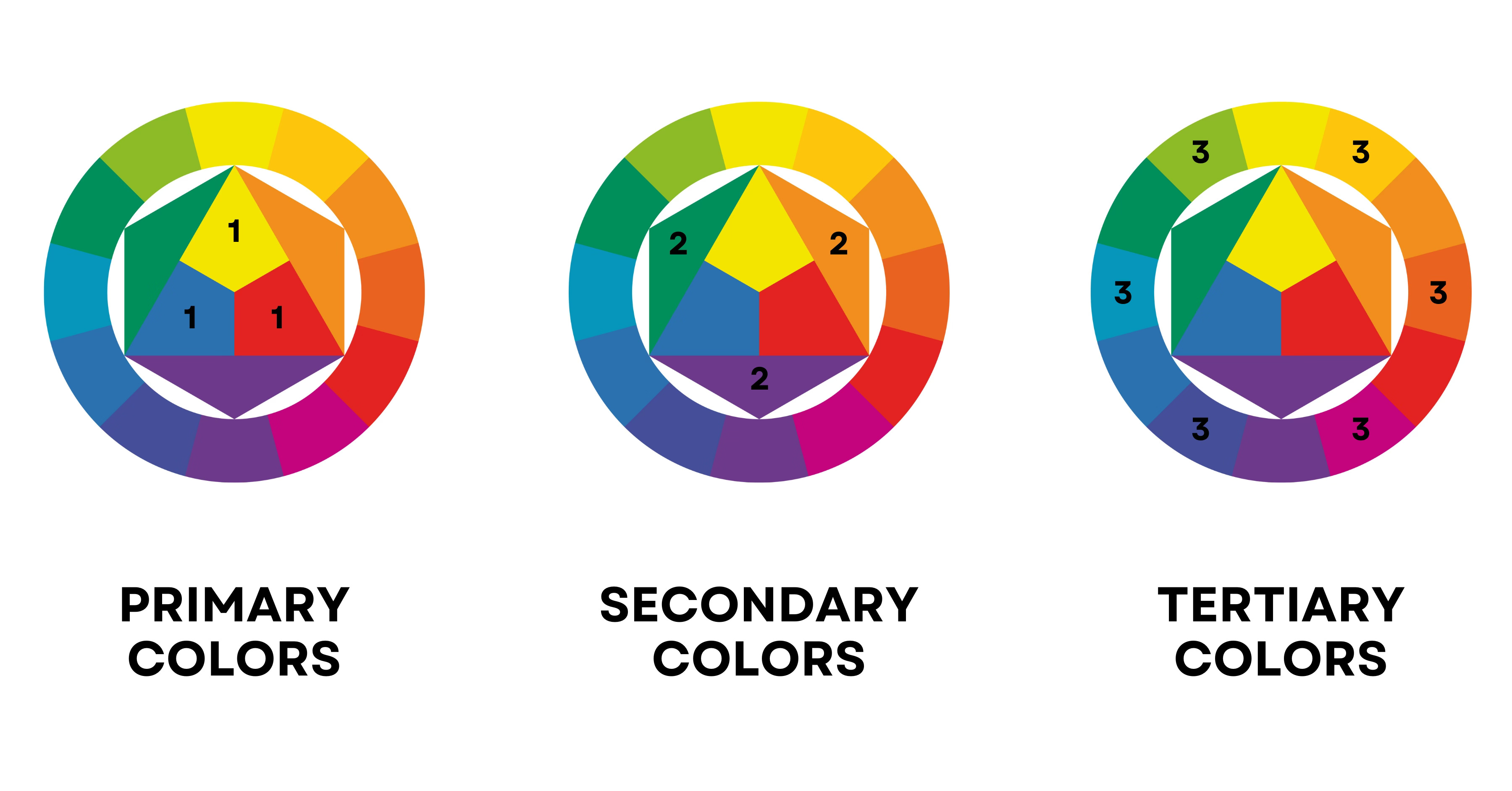
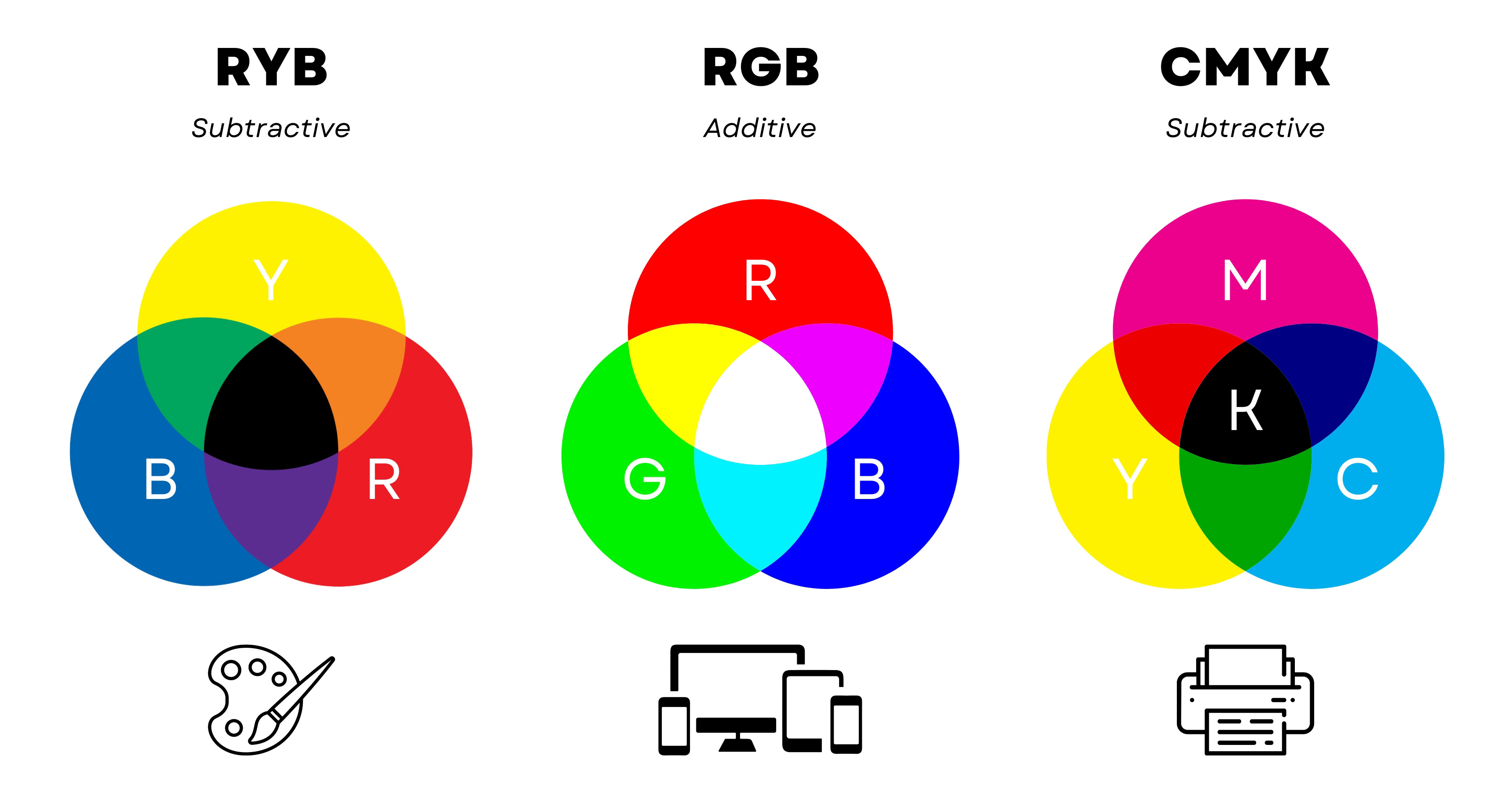
If you took art classes in school, you might be familiar with the red, yellow, and blue (RYB) color wheel. Painters utilize these traditional primary colors to mix pigments and produce material colors.
However, advanced modern color wheels are not limited to 12 colors. Hues, shades, tints, and tones expand the available options.
Hue = a pure pigment
Tint = color created when you add white to any hue
Shade = color created when you add black to any hue
Tone = color created when you add white and black to any hue
When designing digital art for screens, you’ll choose the RGB colorspace, which opens the door to more than 16.7 million hues. Printed works—such as stickers, stationary, signs, or banners—are typically assembled in the cyan, magenta, yellow, and key/black (CMYK) colorspace. With over 16,000 different hue variations available, creatives produce a wide variety of goods!
Color Temperature
Lighting is not only categorized as light, dark, hard, or soft.
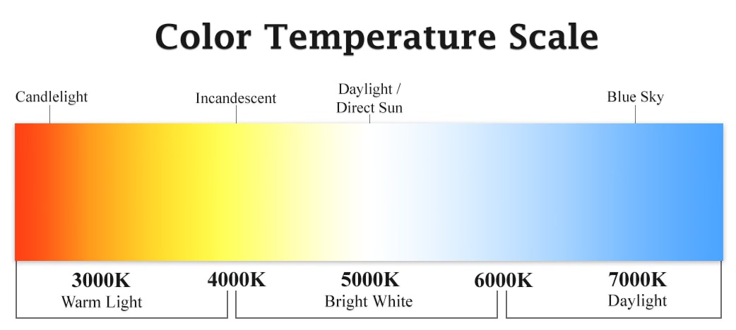
Measured in degrees of Kelvin (K) on a scale of 1,000 to 10,000, color temperature describes the characteristics of a visible light source.
The human eye can’t always be trusted, so photographers and cinematographers commonly use a light meter (or illuminometer) to accurately measure the amount of light present in a scene.
Depending on a camera’s white balance settings, lights can appear drastically different. “Hot” sources emit a yellow-orange glow, while “cold” bulbs shine white or blue. For example, if your equipment is calibrated for daylight (~5,600K), then candlelight would be more warm and inviting on screen.
Why is this important? Lighting sets the mood. When you watch films and television shows, color temperature is a stylistic choice. Whether audiences realize it or not, they’ve been primed to interpret colors in specific ways.
To create the illusion of energy and connection, designers might select a warm color like red, yellow, or orange. Cool colors like blue, green, and purple symbolize peace and nature.
Color Schemes
Age, gender, personality traits, cultural experiences, contextual effects, and social trends influence color perception. As individuals grow, their opinions shift.
It’s impossible to please everyone, but understanding color harmony is advantageous. This basic color theory technique establishes aesthetically pleasing color combinations.
Designers and artists can choose from monochromatic, analogous, complementary, split complementary, triadic, square, or rectangle (tetradic) patterns. It takes some trial and error. When you find the best color palette, you’ll know!
MONOCHROMATIC
Do you need a consistent look and feel? Experiment with varying shades and tints of a single base color. While lacking in contrast, a monochromatic color scheme is uniform and balanced.


ANALOGOUS
An analogous scheme pairs a central color with adjacent hues (e.g., secondary or tertiary accents) on the wheel. If your design requires five options, you can expand your reach by incorporating the next two outside shades. For example, warm analogous colors include reds, oranges, and yellows. This combination develops a soft, ethereal effect.


COMPLEMENTARY
If two colors are complementary, they lie on opposite sides of the wheel. Red and green, yellow and purple, orange and blue, or green and magenta are common examples. Since this pairing creates contrast and visual hierarchy, it’s ideal for informative charts and graphs. You can expand the palette, by including 2-3 shades and tints that belong to the base colors.


SPLIT COMPLEMENTARY
It sounds complicated, but a split complementary scheme includes a dominant color along with two colors on either side of its complement. If the opposite of red is green, then the adjacent shades are yellow-green and blue-green. Another variation is orange, blue-purple, and blue-green. This pattern repeatedly delivers beautiful, balanced palettes that add dimension and interest!


TRIADIC
Triadic palettes encompass at least three equidistant colors on the wheel. Red, blue, and yellow are triadic and primary colors. This pattern is vibrant and dynamic!


SQUARE
A square scheme is defined by four equidistant colors. Three shades are situated ~90 degrees apart from the dominant base color. In other words, there are two sets of complementary colors (e.g., red, green, orange, and blue). The spacing creates a square or diamond shape.


RECTANGLE (TETRADIC)
Similar to the previous method, the rectangle (tetradic) scheme involves four colors. The main difference? They’re not equidistant. Start with your favorite color and proceed to each angle of the rectangle shape.


Inspiration
Need even more inspiration? Here are some ideas:
Talk a walk. There’s plenty of beauty in the natural world. Aside from every shade of green, you can find vibrant flowers, birds, and insects.
Visit a museum. Paintings, photographs, sculptures, ceramics, books, or jewels are only the start. Meditate on beguiling art, transport yourself back in time, and learn from the masters. Art, history, and science have much to offer!
Shop around. High fashion designers set trends and challenge expectations. You can find avant-garde textures, patterns, and hues by flipping through a magazine or watching a runway show.
Experience local culture. Even if you’ve walked around your town several times, you may be surprised. The restaurant down the street may have updated its sign or menu. Or a new building could’ve taken shape. It’s essential to open up your senses to new possibilities. See, hear, touch, taste, and smell!
Watch a movie or television show. Filmmaking is another incredible art form. Space, line, shape, tone, movement, rhythm, and color are key visual components. If you want to extract a specific palette from your favorite cinematic escape, you can explore more @colorpalette.cinema on Instagram.
The moral of the story? Keep your eyes open! You never know what you may find.
If you want to explore more color schemes, try these interactive tools: Adobe Color or Canva’s Color Wheel. Savee and Pinterest also offer a wealth of hex codes!